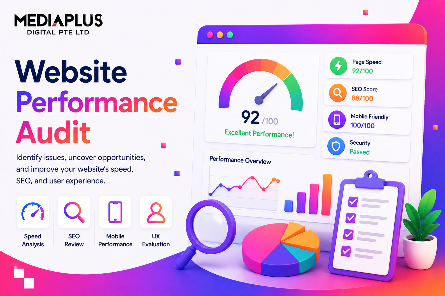
If you want to seriously improve your marketing performance, few assets are as powerful as a well-built landing page.
A great landing page doesn’t try to do everything. It focuses on one goal, one audience, and one action. When done right, it turns paid traffic into leads, trials, bookings, or sales with precision.
In this guide, we’ll break down 13 of the best landing page examples and analyze exactly what makes them effective. After that, we’ll cover the core principles behind high-converting landing page design so you can apply them to your own campaigns.
TL;DR: What Makes the Best Landing Page Design?
Before diving into examples, here’s what all strong landing pages have in common:
-
Clear, benefit-driven headline
-
One primary CTA
-
Clean, distraction-free layout
-
Strong visual hierarchy
-
Strategic social proof
-
Mobile-first design
-
Fast loading speed
Now let’s look at real examples.
What Is a Landing Page?
A landing page is a standalone web page created specifically for a marketing campaign.
Unlike a homepage, it has:
-
One objective
-
One audience
-
One clear call-to-action
Visitors usually arrive from:
-
Paid ads
-
Email campaigns
-
Social media promotions
-
Search ads
Every section of the page is built to support a single conversion goal.
13 of the Best Landing Page Examples
1. Wix – Clear, Beginner-Friendly Conversion
Wix’s landing page targets people who want to create a website but don’t know where to start.
Why it works:
-
Clear headline that builds confidence
-
Strong CTA like “Start Now” repeated across sections
-
Visuals showing real site examples
-
Proof of scale with user statistics
The page reduces intimidation and focuses on ease.
2. ExpressVPN – Trust-Centered Design
Security products need credibility.
What makes it effective:
-
Clean layout with minimal clutter
-
Trust badges and review ratings visible early
-
Simple explanation of complex tech
-
Prominent CTA with reassurance messaging
It builds trust before pushing conversion.
3. Blue Apron – Visual Storytelling
Blue Apron sells convenience and food experience.
Why it converts:
-
High-quality food photography
-
Problem-solution flow structure
-
Clear offers and discount hooks
-
Multiple CTAs placed naturally
It answers the “what’s for dinner?” problem visually.
4. LinkedIn Ads – B2B Clarity
A landing page aimed at marketers and business owners.
What stands out:
-
Clear benefit breakdown
-
Sticky CTA header
-
Structured information blocks
-
Business-oriented tone
It speaks directly to decision-makers.
5. Hootsuite – Strong Value Proposition
The headline leads with a clear benefit.
Why it works:
-
“Save 100+ hours” is concrete and measurable
-
Free trial CTA repeated strategically
-
Recognizable brand logos for credibility
-
Simple explanation of features
It anchors everything around time savings.
6. Uber for Business – Minimal and Focused
This B2B landing page is extremely clean.
Strengths:
-
Signup form in hero section
-
Three concise benefits
-
No unnecessary storytelling
-
Corporate-friendly design
It removes friction and gets straight to conversion.
7. Skillshare – Low Friction Signup
Skillshare focuses on creative learning.
Why it performs:
-
Minimal form fields
-
Social login integration
-
Clear category previews
-
Strong contrast CTA
The page makes signing up feel effortless.
8. Snowflake – Conversion Above All
Highly focused on trial signup.
Why it works:
-
Form immediately visible
-
Simple explanation of offer
-
Reduced technical overload
-
Confidence-building messaging
It prioritizes conversion over brand storytelling.
9. MasterClass – Authority-Driven Design
Celebrity instructors dominate the hero section.
What makes it strong:
-
Authority front and center
-
Video preview builds trust
-
Clean typography and layout
-
Strong CTA contrast
When you have credibility, highlight it boldly.
10. SEMrush – Problem-Specific Targeting
Focused on competitor research.
Why it converts:
-
Clear pain point
-
Immediate interactive input field
-
Strong data-based proof
-
Audience-specific language
It doesn’t try to sell everything. Just one tool.
11. Spotify Premium – Simplicity Wins
Very clean layout.
Why it’s effective:
-
Offer clarity upfront
-
Strong CTA color contrast
-
Minimal distractions
-
Consistent brand visuals
It keeps the decision simple.
12. Calm – Design Reflects Product
Calm’s landing page feels calm.
Why it works:
-
Soft color palette
-
Light copy
-
Emotional positioning
-
Minimal cognitive load
The experience mirrors the product promise.
13. Mailchimp – Personality + Clarity
Playful yet structured.
Why it converts:
-
Bold brand identity
-
Clear benefit blocks
-
Conversational copy
-
Strategic CTA placement
It balances personality with usability.
8 Keys to High-Converting Landing Pages
No matter the industry, the best landing pages follow core principles.
1. Know Your Audience
Everything from tone to visuals must reflect who you’re targeting.
2. Spotlight Your CTA
One main action. Make it visible everywhere.
3. Design for Scanners
Use short sections, strong headings, and whitespace.
4. Mobile-First Optimization
Over half of traffic is mobile. Design accordingly.
5. Remove Friction
Keep forms short. Avoid unnecessary fields.
6. Build Trust Quickly
Use testimonials, logos, statistics, and guarantees.
7. Align Messaging With Ads
Your landing page must match the ad that brought users there.
8. Test Everything
Headlines, button colors, layout structure, offers.
Need a High-Converting Landing Page for Your Business?
If you’re looking for professional landing page design backed by strategy and performance tracking, Mediaplus Digital Singapore provides:
-
Paid Ads Funnel Setup Service
-
A/B Testing and Performance Tracking Service
Instead of just building a visually nice page, their team focuses on:
-
Audience targeting alignment
-
Ad-to-page message match
-
Clear conversion structure
-
Mobile-first performance
-
Measurable ROI tracking
A landing page should not just look good. It should generate leads and revenue consistently.
Final Thoughts
The best landing page design is not about complexity. It’s about clarity.
When you:
-
Focus on one goal
-
Speak directly to your audience
-
Reduce friction
-
Build trust fast
You dramatically increase conversion potential.
Study the examples above. Extract the principles behind them. Then apply those insights strategically to your own campaigns.
That’s how high-performing landing pages are built.