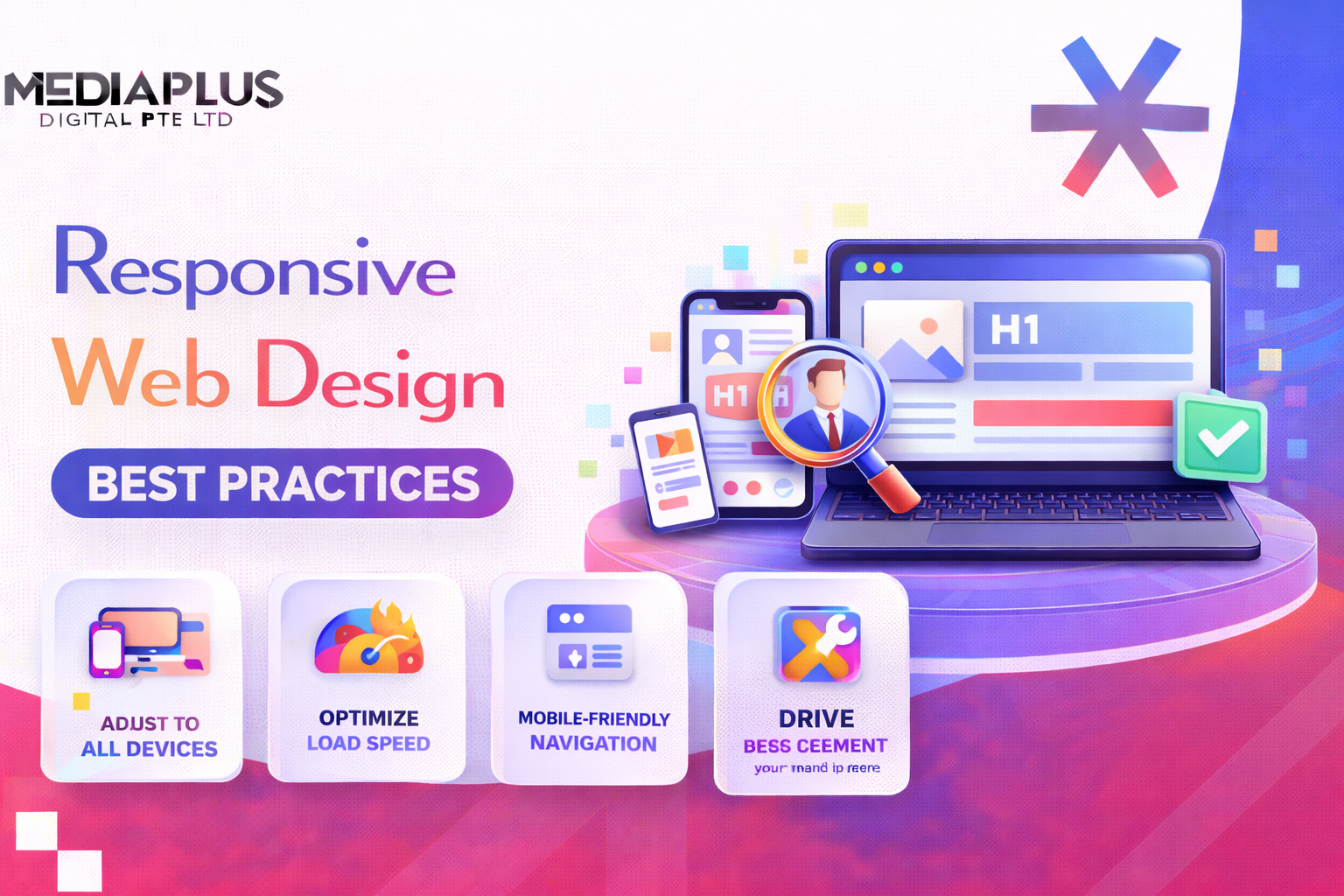
Singapore is a mobile-first market. According to Statista, 64.91% of all web traffic in Singapore now originates from mobile devices, and that share is higher in e-commerce, F&B, and consumer services. A site that performs well on desktop and clumsily on mobile is a site quietly losing money every day. Modern web design has to start from this reality, not work around it.
Responsive web design is the practice of building sites that adapt fluidly across screen sizes, input types, and pixel densities. Done well, it produces a single codebase that feels native on every device. Done badly, it produces a desktop site that has been pinched to fit a phone. This guide covers the eight responsive web design techniques that actually matter in 2026, the best practices that pair with each, the Core Web Vitals consequences of every choice, and the audit steps that close the gap between “looks responsive” and “is responsive”.
Techniques vs Best Practices: How This Guide Splits Them
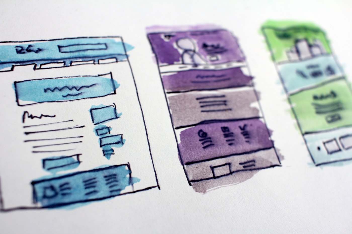
These two phrases get used interchangeably online, and they should not. The distinction matters because they lead to different work:
- Responsive web design techniques are the specific CSS, HTML, and image patterns that produce adaptive layouts. Fluid grids, media queries, container queries, clamp(), the picture element, srcset, viewport units.
- Responsive web design best practices are the strategic and UX decisions that govern how and when to apply those techniques. Mobile-first ordering, touch target sizing, performance budgets, accessibility, content prioritisation.
You need both. A site with strong techniques and weak best practices loads fast and reads badly. A site with strong best practices and weak techniques makes good design decisions that the codebase cannot deliver.
Responsive Web Design Techniques: The Eight That Actually Matter in 2026
Eight techniques cover almost every modern responsive site. The first three are foundational (you cannot skip them). The next three are 2026 standards (you should be using them now). The last two are advanced patterns worth adopting once the basics are solid.
1. Fluid Grids with Relative Units

A fluid grid expresses widths in percentages, fr units, or viewport units rather than fixed pixels. A container at 90% width occupies 90% of the screen whether the screen is a 375px phone or a 2,560px monitor. CSS Grid (using fr units and minmax()) and Flexbox (using flex-basis with percentages) are the modern way to express fluid grids.
.layout { display: grid; grid-template-columns: repeat(auto-fit, minmax(280px, 1fr)); gap: 1.5rem; }
Watch-out: pixel-based widths sneak back in through legacy CSS, image attributes, or third-party widgets. Run a periodic codebase grep for hard-coded px widths above 320.
2. Flexible Media (Images, Video, iframes)
Media must scale within its container. The minimum CSS rule is max-width: 100% and height: auto on every image, video, and embed. Beyond that, the picture element and srcset attribute serve the right asset to the right device.
img { max-width: 100%; height: auto; display: block; }
A common 2026 mistake: shipping a 3,840px hero image to a phone because someone forgot srcset. Mobile users pay for the bytes.
3. Media Queries (Breakpoints That Match Content, Not Devices)
CSS media queries apply different styles at specific viewport widths. The modern approach is content-led breakpoints: introduce a breakpoint where the design actually breaks, not at arbitrary device widths (320, 768, 1024 px). Use min-width media queries to stack mobile-first.
@media (min-width: 48rem) { /* tablet and up styles */ }
Best practice in 2026: anchor breakpoints to rem rather than px so they scale with the user root font size, respecting accessibility preferences.

4. Container Queries (The 2026 Standard)
Container queries respond to the size of a component’s parent container rather than the overall viewport. This is the most significant advancement in responsive web design since media queries themselves, with 93.92% global browser support as of December 2025.
.card { container-type: inline-size; }
@container (min-width: 30rem) { .card__media { float: left; } }
Why it matters: a card sidebar that appears in a 320px sidebar on one page and a 960px main column on another no longer needs two CSS variants. The same component adapts to whatever container it lands in. This makes component libraries genuinely reusable.

5. Fluid Typography with clamp()
Static font-size declarations produce text that is too small on mobile or too large on wide screens. clamp() solves this in one line by setting a minimum, preferred (viewport-relative), and maximum value.
h1 { font-size: clamp(2rem, 4vw + 1rem, 3.5rem); line-height: 1.1; }
Watch-out: clamp() values that drift too low on small viewports break accessibility. Set the floor at 1rem for body and 1.5rem for H1 at minimum.
6. Modern Responsive Images (AVIF, WebP, srcset, picture)
A 2026 responsive image implementation combines four moves:
- Format negotiation: the picture element serves AVIF, WebP, or JPEG based on browser support.
- Resolution switching: srcset with width descriptors serves the right pixel density.
- Art direction: source elements with media attributes serve different crops at different viewports.
- Lazy loading and aspect ratio: loading=”lazy” on below-the-fold images, width and height attributes to prevent layout shift.
<picture>
<source srcset=”hero.avif” type=”image/avif”>
<source srcset=”hero.webp” type=”image/webp”>
<img src=”hero.jpg” srcset=”hero-480.jpg 480w, hero-960.jpg 960w” sizes=”(min-width: 48rem) 50vw, 100vw” width=”1200″ height=”600″ loading=”lazy” alt=”…”>
</picture>
7. CSS Grid and Flexbox for Layout
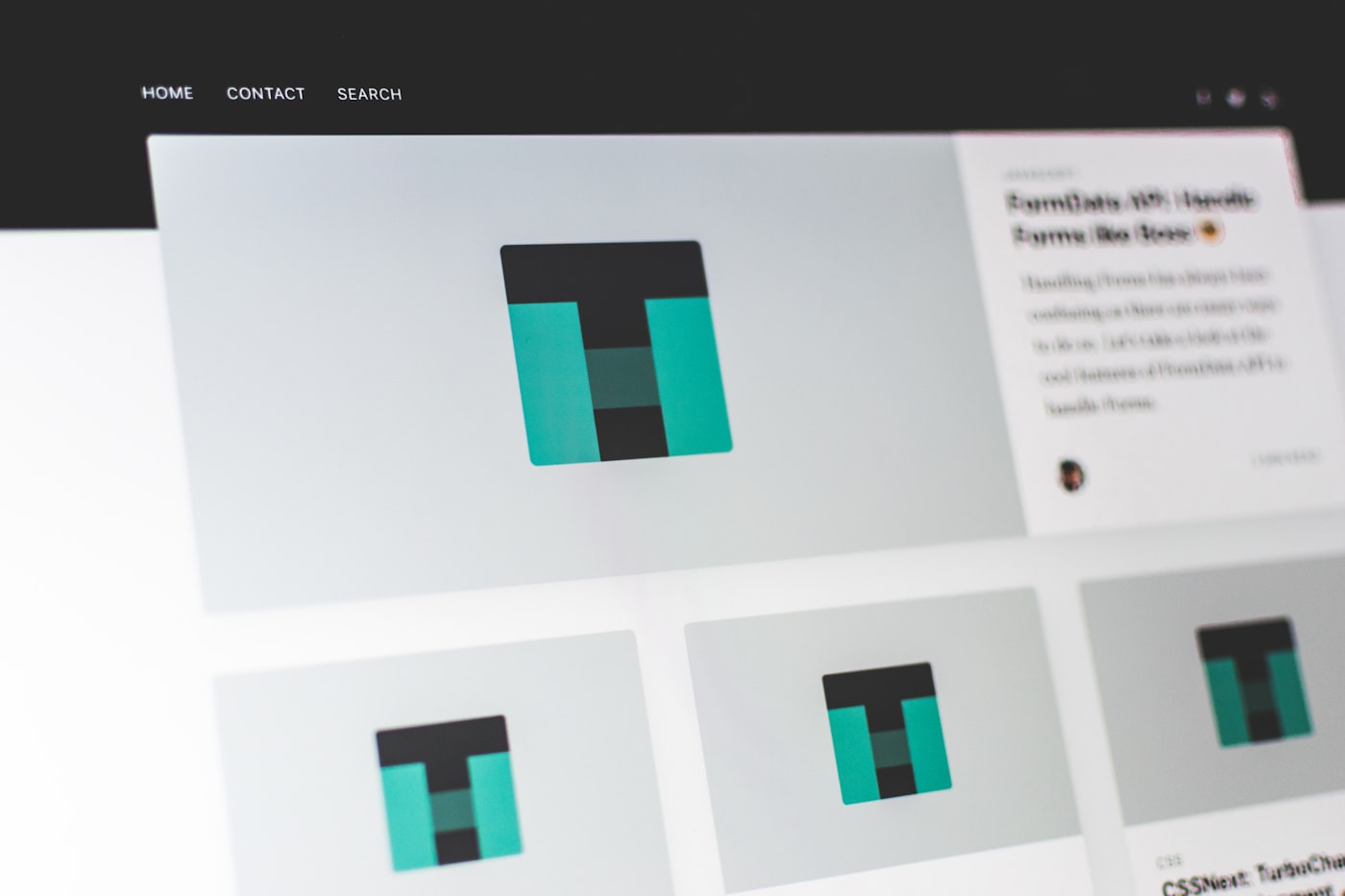
Modern responsive layouts no longer rely on float-based grids or table layouts. CSS Grid handles two-dimensional layouts (rows and columns with explicit relationships). Flexbox handles one-dimensional layouts and alignment.
Rule of thumb:
- Grid: page layouts, card grids, dashboards, anything where rows and columns matter together.
- Flexbox: navigation bars, button groups, form rows, anything that flows in a single direction.
- Combine: outer Grid for the page, inner Flexbox for components inside each grid area.
8. Viewport Units and Modern Sizing (svh, dvh, lvh)
Old viewport units (vh, vw) caused problems on mobile because the URL bar and tab bar changed the actual visible height. The 2024 to 2026 additions, svh (small), lvh (large), and dvh (dynamic), fix this. Use dvh for full-screen sections that should adapt to whatever is currently visible.
.hero { min-height: 100dvh; }
Responsive Web Design Best Practices: How to Use the Techniques Above
Techniques give you the toolkit. Best practices tell you when and how to deploy each. The twelve below cover the decisions that separate sites that “look responsive” from sites that actually perform.
1. Design Mobile-First, Not Mobile-Also
Start every design from the smallest viewport and progressively enhance for larger screens. This forces content prioritisation: every block must justify its place when space is scarce. Sites designed desktop-first and then “scaled down” inherit cluttered phone experiences that bounce 60 to 80% of visitors.
2. Prioritise Above-the-Fold Content for Mobile
On a phone, the first 400 pixels decide whether the user keeps scrolling. Place the value proposition, primary CTA, and the most important social proof inside that window. Hide secondary navigation behind a hamburger; expose the primary action.
3. Hit a Strict Performance Budget on Mobile
Reasonable targets in 2026:
| Metric | Mobile target | Why it matters |
| LCP (Largest Contentful Paint) | Under 2.5s | Google ranking signal; bounce rate above 4s is brutal |
| INP (Interaction to Next Paint) | Under 200ms | Replaced FID in 2024; measures real interactivity |
| CLS (Cumulative Layout Shift) | Under 0.1 | Layout shifts feel buggy and break taps |
| JS payload (transferred) | Under 200KB | Most mobile JS bloat is third-party tags |
| Image payload (above the fold) | Under 500KB total | Hero images are the single biggest waste |
| First Contentful Paint | Under 1.8s | User perceives “site is working” |
4. Touch Targets: 44px Minimum, 56 to 60px for Primary Actions
Apple Human Interface Guidelines mandate 44×44 pixels minimum. Google Material Design recommends 48×48 pixels. For primary CTAs and high-frequency actions (add to cart, book demo, sign up), use 56 to 60 pixels with at least 8 pixels of padding around each target. Cramped buttons on mobile are the single fastest way to kill conversion.
5. Use Real Content for Breakpoint Testing
Lorem Ipsum lies. Test responsive layouts with real headlines, real product names, real long-form copy, and real photography. Singapore brands frequently hit breakpoints with unexpected line breaks because the real headline is 11 words long while the design used a 6-word placeholder.
6. Respect Reduced Motion and Dark Mode Preferences
Honour user system preferences with prefers-reduced-motion and prefers-color-scheme media queries. Accessibility is not optional: roughly one in five users has a vestibular, visual, or motor difference that responsive design should accommodate.
@media (prefers-reduced-motion: reduce) { * { animation-duration: 0.01ms !important; } }
7. Make Forms Mobile-Native
Use the correct input types so phones surface the right keyboards: type=”email”, “tel”, “number”, “date”. Add inputmode for finer control. Set autocomplete attributes so browsers fill addresses, names, and payment fields. Avoid 12-field forms above the fold; progressive disclosure works.
8. Use Loading and Skeleton States, Not Spinners
When content loads asynchronously, show skeleton blocks rather than indefinite spinners. Skeletons set spatial expectations and reduce perceived load time. They also prevent cumulative layout shift when the real content arrives.
9. Test on Real Devices, Not Just Chrome DevTools
Chrome DevTools mobile simulation lies about touch behaviour, network conditions, GPU performance, and viewport edge cases. Maintain a small device lab: a low-end Android (Redmi or similar), a mid-range iPhone, and one tablet. Singapore audiences span both iOS and Android roughly evenly; testing only one is a blind spot.
10. Keep Tap Targets Away from Screen Edges
iOS and Android both use screen edges for system gestures (back swipe, control centre, notification pull). Keep primary actions and links at least 16 pixels from any edge. Bottom navigation bars should respect safe-area-inset on iOS.
11. Ship a Performance Budget File in CI
Add a budget.json or Lighthouse budget to the build pipeline. The CI should fail when a pull request pushes LCP, JS payload, or CLS past the agreed threshold. Performance regressions caught at PR review are 10x cheaper to fix than those discovered after launch.
12. Plan for Foldables, Wide Screens, and Wearables
The Galaxy Z Fold, Pixel Fold, and emerging wearable interfaces stretch the device range. Container queries are the right tool for foldables (components adapt to dual-screen layouts). Test the top 5 devices that match your audience analytics, not every device on the market.
Core Web Vitals: How Each Responsive Choice Affects LCP, INP, and CLS
| Decision | Affects | Why |
| Image format and srcset | LCP | AVIF is 30 to 50% smaller than JPEG; right size cuts hero load time |
| width and height attributes on images | CLS | Browser reserves space before image loads; prevents shift |
| Lazy loading below the fold | LCP | Defers non-critical bytes; faster first paint |
| Heavy third-party scripts | INP | Long-running JS blocks the main thread |
| Font loading strategy | LCP, CLS | font-display: swap and preload prevent layout shift on font load |
| Container queries vs media queries | INP | Container queries reduce CSS reflow on resize |
| Hydration strategy for SSR | INP | Heavy hydration delays interactivity; consider islands or partial hydration |
Treat Core Web Vitals as a launch gate, not a post-launch nicety. Our web design and development practice builds CWV thresholds into every staging environment, and SEO services in Singapore include CWV remediation when an existing site is below threshold.
Frameworks and Tools That Make Responsive Work Faster
| Tool | Use case | Notes |
| Tailwind CSS | Utility-first responsive styling | Dominant in 2026; built-in breakpoints, container queries support |
| CSS Grid + Flexbox (native) | Layout fundamentals | No framework needed for simple sites |
| Bootstrap 5 | Pre-built responsive components | Still common in enterprise SG; heavier than utility-first |
| Container Query Polyfill | Older browsers | Rarely needed in 2026; under 4% of traffic |
| Chrome DevTools Lighthouse | CWV and accessibility audit | Free; run on every PR |
| WebPageTest | Real-device performance | Pick Singapore-region nodes for realistic numbers |
| axe DevTools | Accessibility audit | WCAG 2.2 AA coverage |
| BrowserStack or Sauce Labs | Cross-device testing | For projects with broad device targets |
Common Mistakes That Break Responsive Design in 2026
- Designing in Figma at 1440 width and never opening the 375 width frame.
- Hiding key content on mobile with display: none rather than reorganising it.
- Using viewport-pinch-zoom-disabled meta tags, which fail WCAG 2.2 accessibility.
- Building a hamburger menu without a visible label; users do not all recognise the icon.
- Forgetting to set width and height on responsive images, causing CLS spikes on slow networks.
- Loading the same hero image at 3,840px on every device.
- Using JavaScript for layout decisions that CSS Grid or container queries handle natively.
- Testing on a single device. Singapore audiences split roughly 50/50 between iOS and Android.
- Treating accessibility (WCAG 2.2) as a separate workstream rather than part of responsive QA.
- Skipping real-device testing on Singapore mobile networks; CDN performance varies by carrier.
Singapore-Specific Responsive Considerations
A few Singapore-specific layers most global responsive guides miss:
- Mobile share of traffic is higher than the global average: 64.91% (Statista 2023, rising since). Mobile-first is not optional here.
- Singlish and English-Mandarin mixing affects text length. Test bilingual layouts with real copy, not English placeholder.
- Local payment integrations (PayNow QR, GrabPay, NETS) need mobile-specific UX: QR scanning, quick switch between apps, app-clip-style flows.
- PDPA cookie banners must work responsively on mobile; cramped banners that block content fail UX and compliance.
- PSG-grant-eligible web projects often require WCAG 2.1 AA compliance. Build accessibility into responsive QA, not as a sign-off bolt-on.
- Singapore Hosting region: choose CDN edge nodes in SG or APAC. A US-hosted site adds 200 to 400ms of latency that breaks LCP on mobile.
A 20-Point Responsive Design Audit Checklist
Run this against any responsive site before launch or sign-off. The first ten are layout and visual; the second ten are performance and accessibility.
- No horizontal scrolling at any viewport from 320px to 1920px.
- All interactive elements 44×44 pixels minimum.
- Primary CTAs 56 to 60 pixels on mobile.
- Touch targets at least 16 pixels from screen edges.
- Real content tested at every breakpoint, not Lorem Ipsum.
- Forms use correct input types and inputmode attributes.
- Hamburger menu has a visible “Menu” label.
- Hero loads under 500KB on mobile.
- Typography uses clamp() or fluid sizing.
- Container queries used where component context matters.
- LCP under 2.5s on mid-range Android over 4G.
- INP under 200ms during scroll and form interaction.
- CLS under 0.1 across page-load lifecycle.
- All images use srcset and have explicit width and height.
- Below-fold images use loading=”lazy”.
- Hero image served as AVIF or WebP with JPEG fallback.
- prefers-reduced-motion respected.
- prefers-color-scheme respected (if site has dark mode).
- WCAG 2.2 AA contrast on all text and UI states.
- Real-device tested on at least one iOS and one mid-range Android.
Common Questions
What is the difference between responsive web design techniques and best practices?
Techniques are the specific CSS, HTML, and image patterns (fluid grids, media queries, container queries, clamp(), the picture element). Best practices are the strategic and UX decisions that govern when and how to apply those techniques (mobile-first ordering, touch target sizing, performance budgets, accessibility).
Do I still need media queries in 2026 if container queries are supported?
Yes. Media queries still control viewport-level decisions (overall layout, page typography, breakpoint-specific behaviour). Container queries handle component-level decisions. They complement rather than replace each other.
Is mobile-first still the right approach for a B2B SaaS site?
Usually yes, but with nuance. B2B SaaS often has higher desktop traffic during the workday. Design mobile-first to enforce content discipline, but invest in desktop polish since that is where buying-committee research often happens.
Which framework should I use for responsive design in 2026?
Tailwind CSS dominates for utility-first responsive styling. Native CSS Grid + Flexbox with custom properties is the lightweight alternative. Bootstrap remains common in enterprise environments but ships more CSS than most modern sites need.
How does responsive design affect SEO in Singapore?
Significantly. Google uses mobile-first indexing, so the mobile version of your site is what gets ranked. Core Web Vitals (LCP, INP, CLS) are direct ranking signals. With 64.91% of Singapore traffic on mobile, a non-responsive site loses both rankings and conversions.
How much does a responsive website cost in Singapore?
A starter responsive business site lands at SGD 3,000 to 6,000. Corporate sites SGD 6,000 to 12,000. E-commerce SGD 8,000 to 20,000+. Custom builds SGD 15,000+. Eligible SMEs can subsidise up to 50% through the IMDA PSG grant.
Where to Go From Here
Responsive web design is a craft layer: you cannot fake it with a theme, and you cannot retrofit it cheaply after launch. The techniques above are not academic; they are the difference between a Singapore site that ranks, converts, and ages well, and one that gets quietly rebuilt in 18 months. For a candid audit of an existing site or a fresh build that ships with Core Web Vitals and WCAG 2.2 AA as launch gates, talk to MediaPlus web design and development.
Related reads on the MediaPlus blog: SEO services in Singapore (how responsive choices feed search performance), conversion rate optimisation (how mobile UX moves revenue), WordPress development, Shopify design and development, e-commerce website services, landing page design, mobile app development, and AI SEO and Generative Engine Optimisation.