
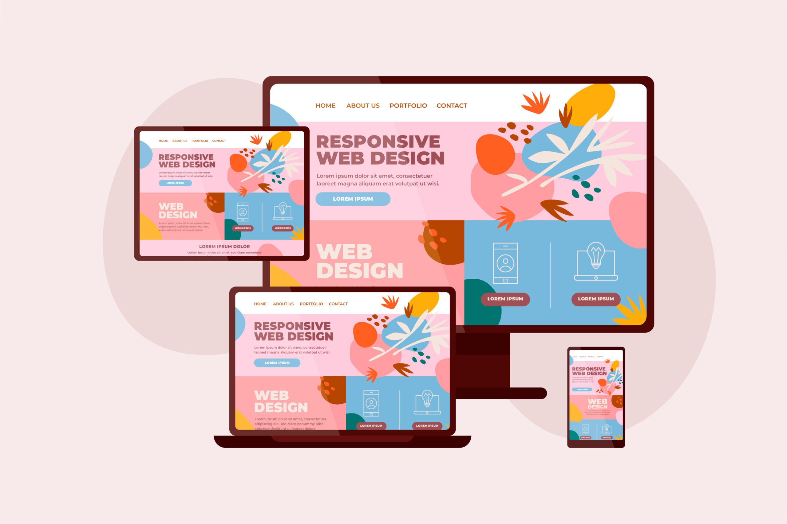
In 2026, responsive web design (RWD) remains a cornerstone of digital success. With mobile devices generating over 60% of global internet traffic, businesses in Singapore cannot afford to overlook mobile adaptability.
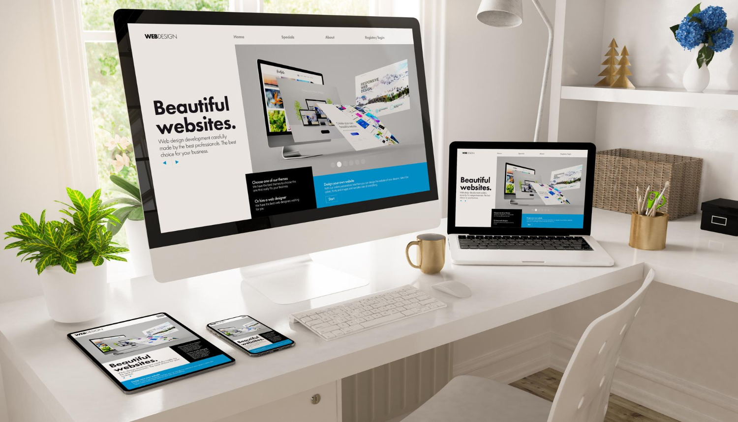
A responsive website ensures seamless performance across screens from smartphones to desktops, while prioritizing user experience, accessibility, and loading speed.
This guide explores modern RWD principles, implementation strategies, and business impacts, with insights drawn from our hands-on experience at MediaPlus Digital Singapore.
What is Responsive Web Design?
Coined by Ethan Marcotte in 2010, responsive web design allows websites to automatically adjust their layout and functionality according to screen size and orientation.
Instead of building multiple versions for different devices, RWD relies on:
-
Fluid grids – layouts that scale proportionally with screen dimensions
-
Flexible media – images and videos that resize dynamically
-
CSS media queries – styling that adapts to device characteristics
The result? A consistent and enjoyable user experience across desktops, tablets, smartphones, and even emerging devices like foldables or wearables.
The Business Impact of Responsive Design
Enhanced User Experience
A responsive website eliminates friction points like excessive scrolling or zooming. Studies show that 94% of negative site feedback relates to design issues often due to poor mobile optimization.
At MediaPlus, responsive redesigns have led to measurable improvements:
-
+34% longer session durations
-
–27% lower bounce rates
-
+22% higher form completions
Whether it’s a corporate site or an e-commerce platform, responsive design directly enhances engagement and trust.
Conversion and Revenue Growth
Streamlined, responsive experiences directly influence business performance:
-
E-commerce sites typically achieve 11–15% higher conversion rates post-RWD
-
Lead forms show 22% higher completion rates
-
Mobile cart abandonment decreases by ~17%
-
SMEs report an average 10.9% revenue increase following responsive implementation
When we redesigned a Singapore fashion retailer’s e-commerce platform, their mobile conversion rate increased by 29% within 60 days delivering full ROI in just three months.
SEO and Discoverability
With Google’s mobile-first indexing, responsive websites rank higher in search results.
Key advantages include:
-
Unified URLs that simplify crawling and indexing
-
Core Web Vitals (LCP, CLS, FID) optimization
-
Up to 40% better SEO performance versus non-responsive sites
Our Singapore clients typically experience +18% organic traffic growth within 4 months after migrating to a fully responsive structure especially for local and mobile searches.
Cost and Maintenance Efficiency
Maintaining a single responsive website is far more efficient than separate desktop and mobile versions:
-
35% lower development costs
-
62% faster content updates
-
Easier integration with CMS, analytics, and SEO systems
One enterprise client reduced annual maintenance costs by $87,000 after consolidating three separate websites (desktop, mobile, and app-like versions) into one responsive codebase.
Our WordPress CMS Development framework allows content teams to update once with automatic adaptation across all devices.

Core Principles of Modern Responsive Design
Mobile-First Approach
Design starts with mobile constraints the smallest viewport ensuring that only essential content appears first. As the screen expands, new features and visuals are progressively enhanced.
This progressive enhancement philosophy results in faster, cleaner websites optimized for Singapore’s on-the-go users.
Flexible Layouts: CSS Grid & Flexbox
CSS Grid structures the overall page layout, while Flexbox manages internal alignment. Together, they enable seamless scaling across screen sizes.
Example:
.responsive-grid {
display: grid;
grid-template-columns: repeat(auto-fit, minmax(250px, 1fr));
gap: 1.5rem;
}
Our testing shows that combining Grid for layout and Flexbox for components delivers optimal flexibility and maintainability.
Optimized Media Delivery
Large images are the top cause of slow websites. Modern responsive sites use srcset, sizes, and lazy loading for speed.
Example:
<img
src=”small.jpg”
srcset=”small.jpg 500w, medium.jpg 1000w, large.jpg 1500w”
sizes=”(max-width: 600px) 100vw, (max-width: 1200px) 50vw, 33vw”
loading=”lazy”
alt=”Descriptive text”>
We also recommend using WebP format, which reduces image payloads by up to 70%.
Responsive Typography
Typography should scale dynamically using relative units (rem, em, vw) instead of fixed pixels.
:root { font-size: 16px; }
@media (min-width: 768px) { :root { font-size: 18px; } }
Readable typography improves both accessibility and brand consistency.
Accessibility and Inclusivity
Good design is accessible design. Maintain usability for all users by following WCAG standards:
-
Use semantic HTML
-
Maintain minimum contrast ratio (4.5:1)
-
Ensure touch targets ≥ 44×44px
-
Preserve visible focus indicators
-
Test with both keyboard and touch navigation
Accessibility should not shrink at smaller viewports critical content must remain available in every layout.
Performance Optimization Essentials
Speed is non-negotiable.
-
53% of users abandon pages that take more than 3 seconds to load
-
Every 100ms improvement boosts conversions by ~1.1%
Essential techniques include:
-
Code minification (CSS, JS, HTML)
-
Browser caching & CDN usage
-
Image compression
-
Limiting third-party scripts
When we optimized a healthcare website, Time to Interactive dropped by 68%, leading to a 23% increase in mobile conversions.
Content and Component Strategy
Modular, Responsive Content
Responsive content must adapt by structure and priority:
-
Use modular content blocks reusable across layouts
-
Implement progressive disclosure for long-form content
-
Maintain content parity for SEO consistency
We often build custom responsive component libraries, ensuring consistent behavior across corporate and e-commerce sites.
Collaborative Component Libraries
Our most successful projects use design systems with documented responsive specifications for each UI component ensuring consistent experiences across large, complex websites.
Emerging Trends in Responsive Design (2026)
Progressive Web Apps (PWAs)
PWAs blend web accessibility with app-like performance:
-
Offline access
-
Home screen installation
-
Push notifications
Businesses adopting PWAs see ~45% more returning visitors compared to traditional sites.
Adaptive Dark Mode
Modern users prefer websites that match their device’s theme.
Example:
Dark mode improves comfort, accessibility, and battery efficiency on OLED screens.
Voice and AI Personalization
With 40% of adults using voice search daily, websites should:
-
Optimize content for conversational queries
-
Implement structured data for discoverability
-
Support hybrid voice/touch interactions
Our hospitality clients have seen +27% growth in voice search discovery after adding structured markup.
Variable Fonts & Container Queries
Variable fonts reduce file size by up to 70% while adapting dynamically to device characteristics.
Example:
Preparing for Emerging Devices
Responsive design now extends to:
-
Foldable and flexible screens
-
Wearable devices
-
Augmented reality interfaces
Testing on real devices not just emulators is critical to ensuring usability across this expanding ecosystem.
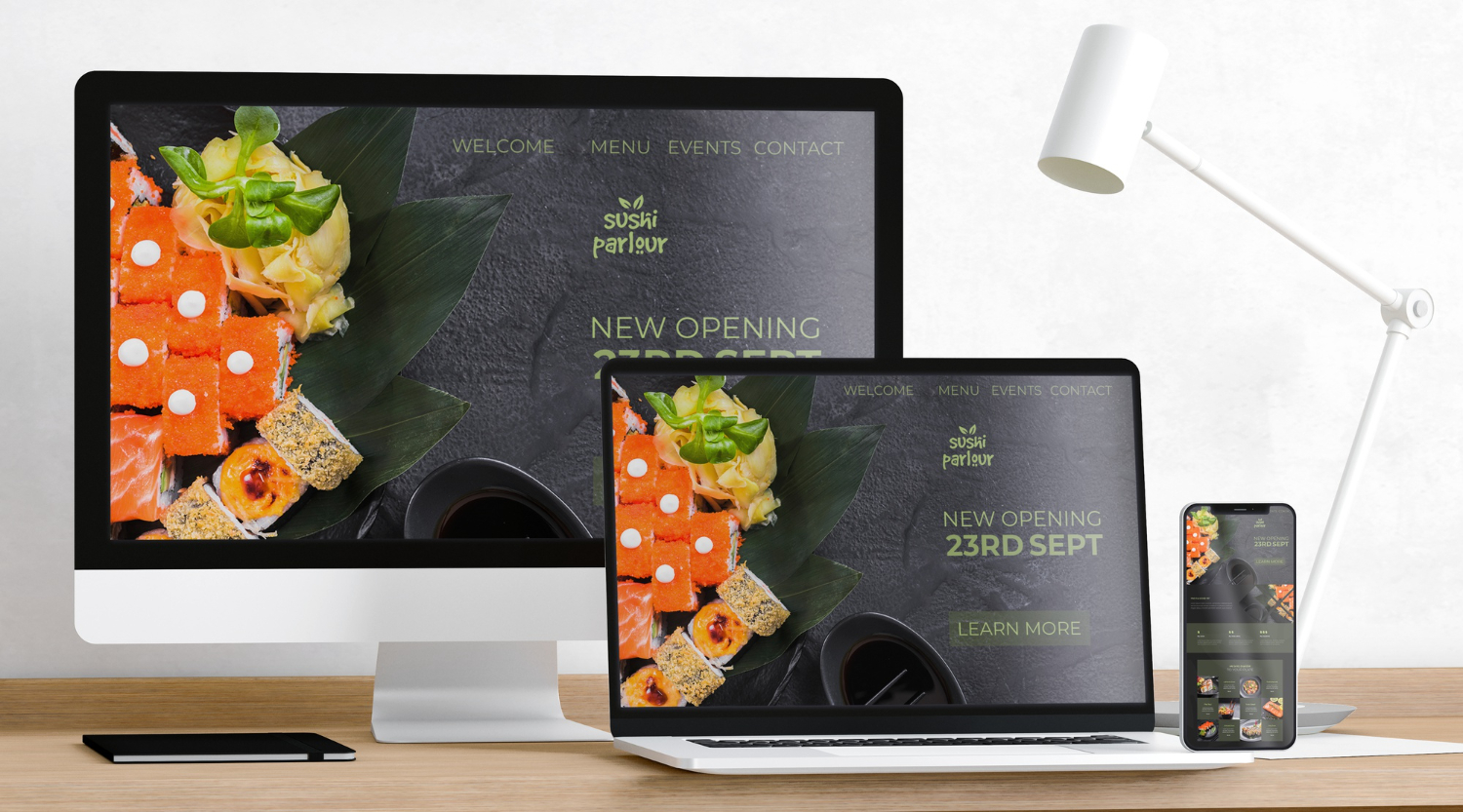
Responsive Web Design in Practice: Singapore Case Example
A Singapore-based fashion retailer approached us for a full responsive redesign of their online store.
Results within 60 days:
-
Mobile conversion rate: +29%
-
Bounce rate: –22%
-
ROI achieved within 3 months
The project combined E-commerce Website Development, performance optimization, and UX testing across 15 real devices.
Why Partner with MediaPlus Digital
At MediaPlus Digital, we specialize in:
Our design philosophy integrates strategy, performance, and accessibility, ensuring your website not only looks great but also drives measurable results.
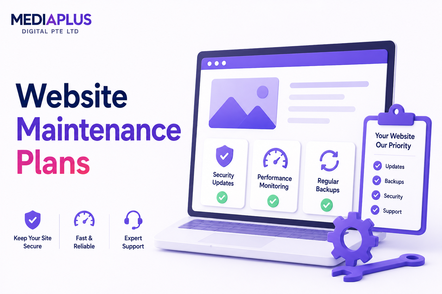
We also provide Website Maintenance services to keep your site secure, updated, and optimized long-term.
Conclusion
In 2026, responsive web design is no longer a nice-to-have. It is a basic requirement. With mobile-first experiences, fast load times, and performance-focused development becoming the norm, responsiveness now defines how effectively brands engage users online.
For businesses investing in web design Singapore, this directly translates into faster websites, stronger SEO performance, and higher customer trust. Whether you are refreshing a corporate website or launching a new ecommerce platform, a responsive foundation ensures your site performs well across devices and supports long-term growth.
If you are ready to future-proof your website, contact MediaPlus Digital Singapore today. Their team builds responsive, user-focused websites designed to scale with your business and deliver real results.