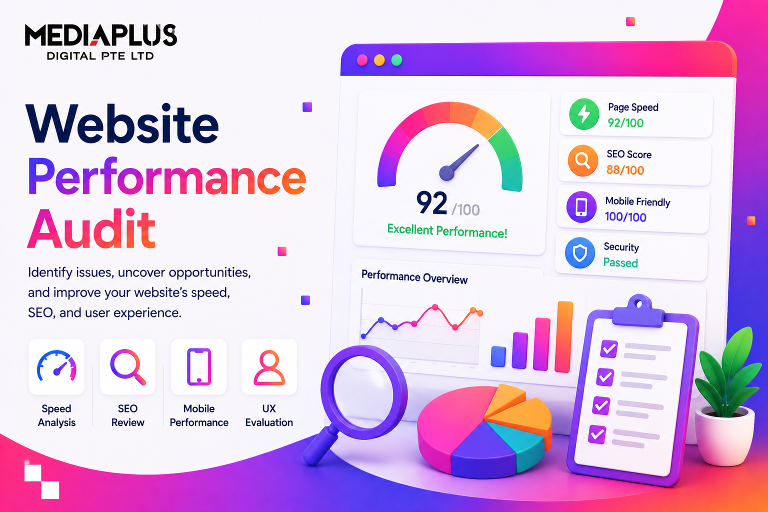
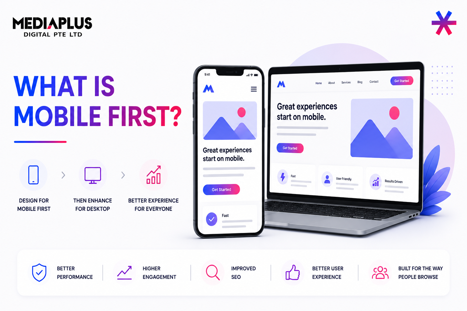
If you are wondering what is mobile first, the short answer is this: mobile first is a design and development approach where websites and digital products are designed for smartphones first, then progressively enhanced for tablets and desktops.
This approach exists because mobile is no longer secondary. Nearly half of global web traffic now comes from smartphones, and in many markets, mobile users already outnumber desktop users. Designing for desktop first and shrinking things down later often leads to slow load times, cluttered layouts, and frustrating mobile experiences.
Mobile-first design flips that thinking and starts with real user constraints from day one.
What Is Mobile-First Design?
Mobile-first design means starting the design process with the smallest screen size first, usually smartphones, and then scaling up to larger screens.
Instead of asking “How do we make this desktop site work on mobile?”, teams ask:
“What does a mobile user actually need right now?”
This forces prioritisation. Limited screen space makes it clear which content, actions, and features truly matter. Anything non-essential is removed or deferred to larger screens.
The concept was formally popularised in 2009 by Luke Wroblewski, then a Google Product Director, and has since become a foundation of modern UX and web development practice.
Mobile First vs Desktop First: The Core Difference
Before mobile-first became mainstream, most websites followed a desktop-first approach, also known as graceful degradation. Designers built full-featured desktop sites and then stripped elements away for mobile.
The problem is that many desktop elements do not adapt well to small screens. Navigation becomes cramped, buttons are hard to tap, and performance suffers.
Mobile-first design follows progressive enhancement instead:
-
Start with a clean, fast mobile experience
-
Add richer layouts, interactions, and content as screen size and capability increase
This results in better usability on all devices, not just mobile.
Why Mobile-First Design Matters
Mobile-first design is no longer optional. It directly affects user experience, SEO, and business performance.
1. Mobile Usage Dominates
Mobile users now account for well over half of global web usage. People also spend hours per day on smartphones, checking them dozens of times daily. Websites that ignore mobile behaviour fall behind quickly.
2. Google Uses Mobile-First Indexing
Google primarily evaluates the mobile version of a site for ranking. A slow, cluttered, or poorly structured mobile site can hurt visibility, even if the desktop version looks great.
3. Performance and Conversion
Mobile-first layouts are typically lighter and faster. Faster load times reduce bounce rates and improve conversion, especially on slower mobile networks.
4. Accessibility Benefits
Simpler layouts, clear hierarchies, readable text, and touch-friendly elements make mobile-first designs more accessible to users with disabilities and motor limitations.
Core Principles of Mobile-First Design
A strong mobile-first approach usually follows these principles:
Content First
Only the most important information appears on the initial mobile view. Mobile users are often on the go, so clarity matters more than completeness.
Progressive Enhancement
The mobile experience is the foundation. Tablets and desktops receive additional layout space, visuals, and features without breaking the core experience.
Touch-Friendly Interfaces
Buttons and links are designed for fingers, not cursors. Tap targets are large enough and spaced to avoid accidental clicks.
Responsive Layouts
Fluid grids, flexible images, and media queries ensure layouts adapt smoothly across screen sizes.
Mobile First vs Responsive Design
These two terms are often confused.
-
Mobile-first design is a strategy. It defines where the design process starts.
-
Responsive design is a technique. It ensures layouts adapt to different screen sizes.
You can build a responsive site that is not mobile-first if it was designed for desktop first. The best modern sites combine both: mobile-first thinking with responsive implementation.
How to Implement a Mobile-First Approach
A practical mobile-first workflow usually looks like this:
-
Understand mobile user intent: Identify what users want to do on mobile. Context matters. Someone on a phone may want speed and clarity, not deep exploration.
-
Design for the smallest screen first: Start with smartphone wireframes or prototypes. This exposes unnecessary elements early.
-
Define a clear content hierarchy: Important actions and information go first. Secondary content comes later or on larger screens.
-
Design for touch: Buttons, menus, and form fields must be easy to tap and forgiving.
-
Enhance for larger screens: Add richer visuals, multi-column layouts, and advanced interactions as space allows.
-
Optimise performance: Compress images, limit scripts, and prioritise loading speed.
-
Test on real devices: Mobile-first design must be validated on actual phones and tablets, not just emulators. Platforms like BrowserStack are commonly used to test layouts and performance across real devices and browsers.
Examples of Mobile-First Design Done Well
-
Airbnb focuses on search and booking actions first, with large visuals and simple filters.
-
Dropbox uses clean layouts and clear calls to action that work equally well on small screens.
-
Slack prioritises speed, login access, and feature discovery with lightweight mobile interfaces.
These sites feel effortless on mobile because they were designed with mobile constraints in mind from the start.
Mobile-First Design and Accessibility
Mobile-first design naturally supports accessibility when done correctly. Clear visual hierarchy, readable text, high contrast, and logical navigation help all users.
Performance metrics like Core Web Vitals and data from Chrome User Experience Report reinforce the importance of fast loading, visual stability, and responsive interaction, all of which align closely with mobile-first principles.
Final Thoughts: Why Mobile First Is Now the Default
Mobile-first design reflects how people actually use the web today. It forces teams to focus on clarity, speed, and purpose, especially in moments when users are distracted, on the move, or working with limited screen space.
When done well, mobile-first design does not weaken desktop experiences. It strengthens them by removing clutter, sharpening content hierarchy, and ensuring that every element earns its place, regardless of screen size.
In a digital landscape where attention spans are short and competition is literally one tap away, mobile-first is no longer a trend. It is the baseline for building usable, scalable, and future-ready digital experiences.
For brands that want to implement this approach properly, working with an experienced web design company makes a real difference. MediaPlus Digital Singapore supports businesses with mobile-first web design strategies that go beyond visuals, aligning UX, performance, SEO, and conversion goals so websites are not just responsive, but built to grow with how users actually behave online.