SaaS websites are the hardest thing to design well on the open internet. Consumer stores sell things you can touch and rate. Corporate brochures sell credibility. A SaaS site sells a product that the buyer cannot taste, cannot photograph, and cannot fully understand until they use it for two weeks.
Everything else about SaaS design follows from that constraint. The homepage has to compress an abstract product into a concrete promise inside five seconds. The pricing page has to translate a usage model into something a finance buyer can approve. The signup flow has to give enough product surface for the buyer to feel confident, without giving so much that they decide they have seen enough. The companion read on B2B vs B2C digital marketing covers why this constraint is fundamentally different from selling to consumers.
This guide walks through the principles that the highest-converting SaaS sites in 2026 share, anchored to real sites worth studying rather than abstract diagrams.
The Five-Second Test: Five Questions Your Homepage Must Answer
The benchmark research (NN/g, Wynter, Webstacks) converges on the same point: a SaaS visitor decides in roughly five seconds whether to keep reading. The homepage must answer five questions in that window:
- What is this? In product-category language a buyer already understands, not invented marketing terms.
- Who is it for? Specific enough that the wrong buyer self-disqualifies in two seconds.
- What outcome does it create? An end-state the buyer wants, not a feature description.
- How do I know it is real? Live product surface, customer logos, or a clear demo trigger.
- What is my next step? One primary CTA, unmissable.
A homepage that takes 30 seconds to answer those questions is a homepage that loses 60 to 80% of qualified visitors. The job of design is to compress those answers into the visible viewport. The same constraint applies to campaign landing pages, where the five-second test is even less forgiving because paid traffic has zero patience.
Five Sites That Do It Well (and What to Steal From Each)
Stripe: clarity through code
Stripe sells to two audiences that distrust each other’s language: developers, who want API depth, and finance buyers, who want compliance and ROI. The site solves this without compromise by giving each audience its own path. The homepage hero balances a clear product-category statement (“Financial infrastructure for the internet”) with a live code snippet that immediately signals “for developers”. Industry buyers follow the “Why Stripe” path; developers follow “Docs”. Steal: dual-audience navigation that does not water down either voice.
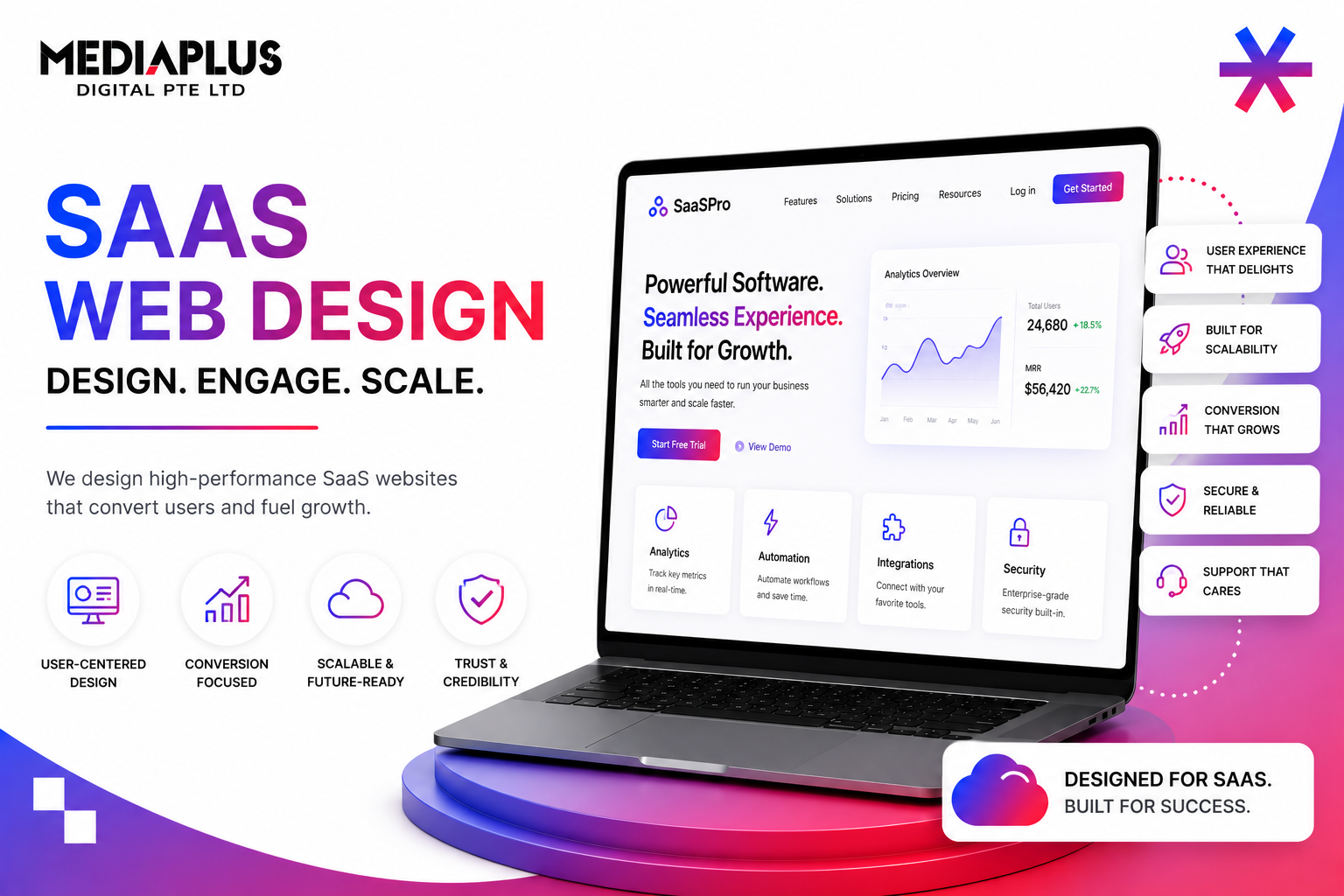
Notion: outcome-first hero with real UI
Notion’s hero promise is outcome-first (“Write, plan, share. With AI at your side.”) followed by an actual Notion canvas, not an abstract illustration. Buyers see what they will use in the first frame above the fold. Below the fold, feature cards show real UI, not stock graphics. Conversion benefits compound when buyers do not have to imagine the product. Steal: real product surfaces above the fold, headline under 8 words, single primary CTA.
Linear: motion that demonstrates speed
Linear sells speed as a category positioning. The site demonstrates speed instead of claiming it: smooth scroll, instant transitions, motion under 200ms, dark-mode-first aesthetic, and product video that runs at native frame rates. The whole site feels fast because it is fast. Steal: align brand promise with site behaviour. If you sell speed, your site must be the fastest in the category.
Vercel: the marketing site as a live demo
Vercel folds documentation, dashboards, and live performance data into its marketing site. A buyer can see Lighthouse scores, deployment times, and edge function latencies before signing up. The product is proven on the homepage, not described. Steal: where your product produces metrics buyers care about, surface those metrics on the marketing site in real time.
Framer: the site is the product
Framer is a website builder, and its own marketing site is built in Framer. Every animation, layout, and interaction is something a customer could ship on their own site. This is the hardest pattern to copy because it requires the marketing site and the product to share a tech stack. When it works, it is the strongest demo a SaaS can build. Steal: where possible, build your marketing site on your own product. The credibility compounds.
Conversion Benchmarks That Actually Mean Something
Most SaaS landing page benchmark numbers are useless because they mix industries and funnel stages. The numbers below filter for B2B SaaS specifically and split by funnel stage. For broader context on how SaaS pipeline metrics differ from consumer brands, see our complete guide to lead generation and the B2B SEO playbook that pairs with it.
|
Metric |
B2B SaaS benchmark |
Top quartile |
|
Visitor to lead |
2 to 5% |
8 to 15% |
|
Visitor to trial signup (PLG) |
3 to 8% |
12 to 20% |
|
Lead to MQL |
20 to 35% |
40%+ |
|
MQL to SQL |
13 to 25% |
35%+ |
|
SQL to opportunity |
20 to 30% |
40%+ |
|
Demo show rate |
70 to 85% |
90%+ |
|
Free-to-paid conversion |
2 to 5% (broad), 15 to 25% (qualified) |
30%+ |
|
Average sales cycle |
3 to 9 months |
Under 3 months |
Sources: Varos 2026, OpenView, First Page Sage. Singapore SaaS lands in similar ranges, with regional buyers slightly more demo-driven and slightly less self-serve than US peers.
The Pages a SaaS Site Cannot Cut
A consumer site can survive with five pages. A SaaS site has at least nine, each doing a specific job. Cutting any of them quietly hurts conversion. The blog, in particular, is not optional; it is the engine of every content cluster strategy that drives organic pipeline for SaaS.
|
Page |
Job to be done |
|
Homepage |
Compress product, audience, outcome, proof, and next step into 5 seconds |
|
Product / feature pages |
Show real UI, depth, and integrations per capability |
|
Use case or industry pages |
Translate the same product for different buyer pains |
|
Pricing |
Tiered packaging with visible numbers; “contact us” only for enterprise |
|
Customer stories |
Quantified before-after with real names, used as procurement evidence |
|
Docs or help centre |
Public, indexable, signals real product depth to evaluators |
|
Security and compliance |
SOC 2, ISO 27001, MAS TRM, hosting region, DPO contact |
|
Changelog or blog |
Living signal that the product is actively shipped |
|
Demo / contact |
Calendar-embedded booking flow, ideally pre-qualifying |
Pricing Pages: The SaaS Page Most Teams Get Wrong
A bad pricing page is the single largest source of preventable conversion loss in B2B SaaS. Three patterns work in 2026:
- Three or four tiers with clear differentiation, labelled by buyer (Starter, Growth, Scale, Enterprise).
- Per-tier price visible at the top, not buried under feature toggles.
- A “what is included” matrix below the tier cards, ordered by what buyers ask about (seats, usage limits, integrations, support SLA).
- A pricing calculator if usage-based pricing exists; never make the buyer do math.
- An honest “Enterprise: contact us” tier only at the top end, never as the only option.
- A FAQ at the bottom answering the questions that bounce evaluators (billing cycle, cancellation, data export, security).
The buyer’s mental model is “I want to know if I can afford this and which tier I need before I talk to anyone”. A pricing page that answers neither is a pricing page that fails its job. If you do not have the data yet to set tier boundaries, run CRO experiments on different anchor prices for 4 to 8 weeks before locking pricing publicly.
Trial Versus Demo: A Strategic Choice, Not a Default
SaaS teams default to whichever conversion event their founder is familiar with. Both work, but they suit different products and segments.
|
Pattern |
Suits |
Risk |
|
Free trial (no card) |
Self-serve, low-touch, $30 to $300 ACV |
Trial-to-paid conversion can collapse without onboarding |
|
Free trial (with card) |
Mid-market SaaS, $500 to $5,000 ACV |
Reduces signups by ~60% but lifts trial-to-paid |
|
Freemium |
Network-effect products, broad usage |
Free users may never convert; cost to serve must stay low |
|
Live demo only |
Enterprise SaaS, $25K+ ACV |
Long sales cycle; pipeline depends on SDR motion |
|
Self-serve + Sales-assist hybrid |
Most modern B2B SaaS |
Complex to operate; requires PLG instrumentation |
The right answer is product-shape dependent. A site that offers everything (free trial + demo + freemium + sales) usually converts worse than one that picks one primary motion and supports it with one secondary.
A/B Testing: Test the Things That Move Real Numbers
SaaS teams over-test colours and under-test structure. The tests that produce material wins, ranked by impact in our experience:
- Hero headline (the actual words). Largest single lift, regularly 15 to 40%.
- Primary CTA copy and placement. 5 to 25% lifts common.
- Social proof position (above the fold vs below). 5 to 15% lifts.
- Pricing page anchor (highest tier visible first or last). 5 to 15% lifts on conversion to mid tier.
- Demo booking form length (5 fields vs 9). 20 to 40% lifts on form completion.
- Onboarding sequence (which screen to show first). Material trial-to-paid impact.
Button colour tests produce sub-2% lifts and consume a sample size that could test something meaningful. Stop running them. Our CRO services in Singapore page details the test prioritisation framework we use with clients.
The 2026 AI Search Layer Most SaaS Sites Ignore
SaaS buyers in 2026 increasingly ask ChatGPT and Perplexity questions like “best CRM for a 20-person Singapore agency” before they visit any vendor site. If your site is not cited in the answer, you are not in the consideration set. Read our take on AI SEO and Generative Engine Optimisation in Singapore and how AI is transforming digital marketing for the tactics that get SaaS sites cited.
The Singapore-Specific Layer for SaaS
A SaaS site launching from Singapore or targeting regional buyers needs four additions most global templates miss:
- SGD pricing visible alongside USD. Default-USD pricing signals “global brand that has not localised”, which hurts conversion with local SMEs.
- Compliance badges relevant to local buyers: MAS TRM for finance, MTCS for cloud, PDPA for any consumer-touching SaaS, ISO 27001 for general B2B.
- PSG grant eligibility signal if applicable. SG SMEs filter for grant-eligible vendors and expect it stated on pricing or homepage.
- Local case studies or logos. A regional buyer scanning the homepage for proof discounts US-only logos heavily.
For a SaaS marketing site that pairs Stripe-level clarity with Singapore-aware positioning, talk to MediaPlus web design. Pair the build with SEO services in Singapore for the pipeline arm of the same playbook, and browse more on the MediaPlus blog.