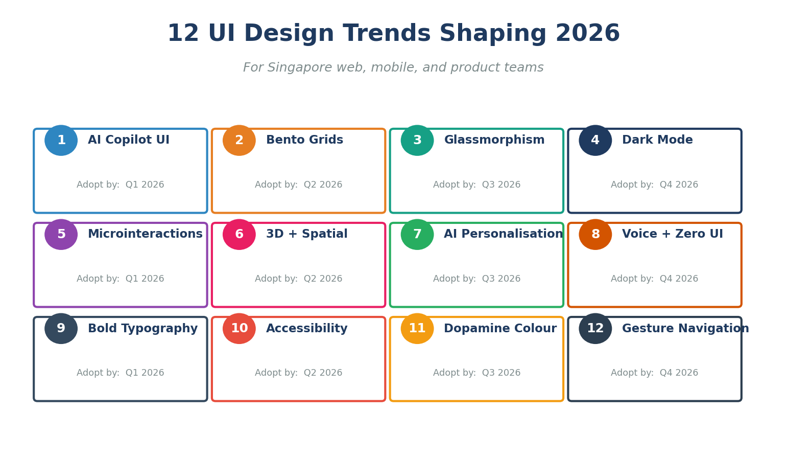
The leading UI trends in 2026 are AI copilot interfaces, bento grid layouts, responsible glassmorphism, dark mode as a default, micro-interactions, 3D and spatial design, AI-driven personalisation, voice and zero UI, bold and fluid typography, accessibility-first design, dopamine colour palettes, and gesture-based mobile navigation. Together, these patterns reflect a shift from purely visual styling to context-aware, inclusive, and emotionally engaging interfaces.
Free download: Get our UI Trends 2026 Adoption Checklist (Excel) to score your website or app against every trend in this guide.
1. Why UI Trends Matter More Than Ever in 2026
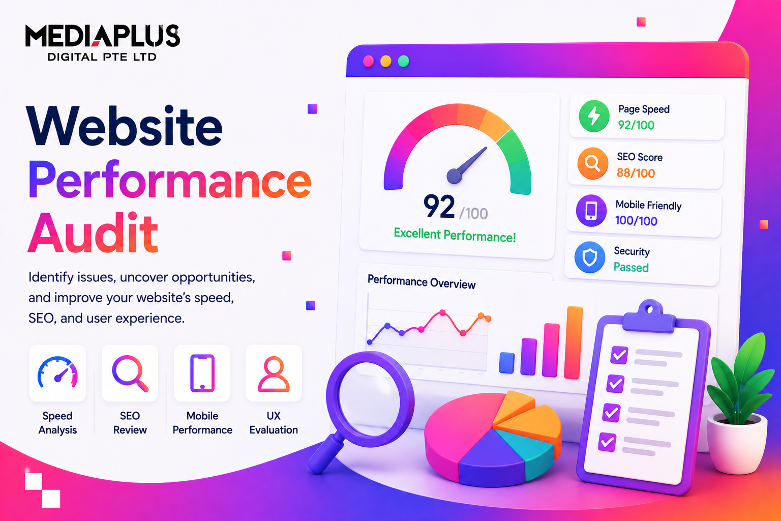
Users form an opinion about a website in 50 milliseconds (Behaviour and Information Technology, Lindgaard et al.) and 88% of users will not return after a poor experience (Toptal). With AI tools shipping new product surfaces every week, modern UI design has become the most reliable way to differentiate. The right pattern, applied at the right moment, can double conversion (Forrester) and quadruple engagement (Adobe). The wrong one, even applied beautifully, can erode trust in a single session.
In 2026, UI is no longer about decoration. It is about helping a busy human (or an AI agent acting on their behalf) achieve an outcome quickly, accessibly, and confidently. This guide walks through the 12 patterns that matter most, with Singapore-specific data, working examples, and a free adoption checklist.
2. The Singapore UI Snapshot
Singapore is one of the most digitally mature consumer markets in the world. UI design choices land on devices and screen sizes that look like this:
|
Metric |
Value |
Source |
|
Internet penetration |
98.4% |
DataReportal 2026 |
|
Internet users |
5.78 million |
DataReportal 2026 |
|
Mobile connections |
9.79 million (166% of population) |
DataReportal 2026 |
|
Smartphone penetration |
95%+ |
IMDA / DataReportal |
|
Daily online time |
7h 12m |
DataReportal 2026 |
|
Time on TikTok per month |
34 hours |
DataReportal 2026 |
|
Mobile share of e-commerce |
77.58% |
Statista 2025 |
|
SG e-commerce market 2026 |
USD 6.17 billion |
Mordor Intelligence |
|
Singapore advertising market |
USD 2.79B (2025) |
Statista |
In other words, almost every customer touchpoint in Singapore is mobile-first, mobile-fast, and competing for attention with TikTok and Shopee. UI patterns that are not optimised for thumb reach, low data, and fast load are not going to land. For mobile-specific builds, see MediaPlus mobile app development and web design.
3. UI Numbers You Cannot Ignore
|
Insight |
Value |
Source |
|
First impression formed in |
50 milliseconds |
Behaviour & IT, Lindgaard et al. |
|
Users abandon poor design |
88% |
Toptal / Adobe |
|
ROI per USD 1 invested in UX |
USD 100 (9,900%) |
Forrester |
|
Users expecting hyper-personalisation |
71% |
McKinsey 2025 |
|
Users frustrated without personalisation |
76% |
McKinsey 2025 |
|
Conversion lift from clear visual hierarchy + motion |
~30% |
Index.dev / NN/g |
|
Engagement lift from microinteractions |
~20% |
Index.dev |
|
Page time lift from 3D elements |
6x |
WebGL studies |
|
Designers using generative AI in workflows |
93% |
Figma 2026 Designer Report |
|
Designers naming AI as #1 impact |
73% |
Figma 2026 Designer Report |
|
Sites meeting Google Core Web Vitals |
47% |
HTTP Archive 2025 |
|
Mobile share of global web traffic |
58 to 60% |
Statista 2025 |
4. The 12 UI Trends Shaping 2026
4.1 AI Copilot UI (Not Autopilot)
The biggest shift in 2026 UI is the move from “AI does it for you” to “AI helps you do it better”. Users rejected fully autonomous flows in 2024 to 2025 because they felt out of control. The new pattern: a persistent but optional AI assistant that suggests, drafts, and explains, with a clear human-controlled final step. Notion, Figma, Linear, and HubSpot all moved in this direction in 2025.
How to apply: add a small AI button or slash command (cmd-K), surface AI suggestions inline next to the user’s task (not in a separate chat), let users edit before applying, and always show what data the AI used. Avoid covering the canvas with a full AI panel by default.
More on the broader trend in our blog on how AI is transforming digital marketing.
4.2 Bento Grid Layouts
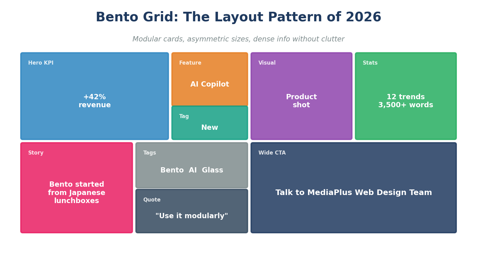
Bento grids dominated 2025 because Apple, Samsung, Microsoft, and Google all use them on product and OS pages. The pattern: card-based layouts with asymmetric proportions inspired by Japanese lunchboxes. Each card holds one piece of information (a KPI, a feature, a quote, a visual), and the grid composes density without clutter.
How to apply: set a strict 12-column or 16-column grid; use 4 to 9 cards above the fold; vary card sizes by importance (hero card 2x larger than secondary); avoid more than 2 colour temperatures per grid; ensure every card collapses gracefully into a single column on mobile.
Best for: SaaS landing pages, dashboards, product launch pages, agency portfolios. Avoid for long-form editorial content or transactional flows where linear reading wins.
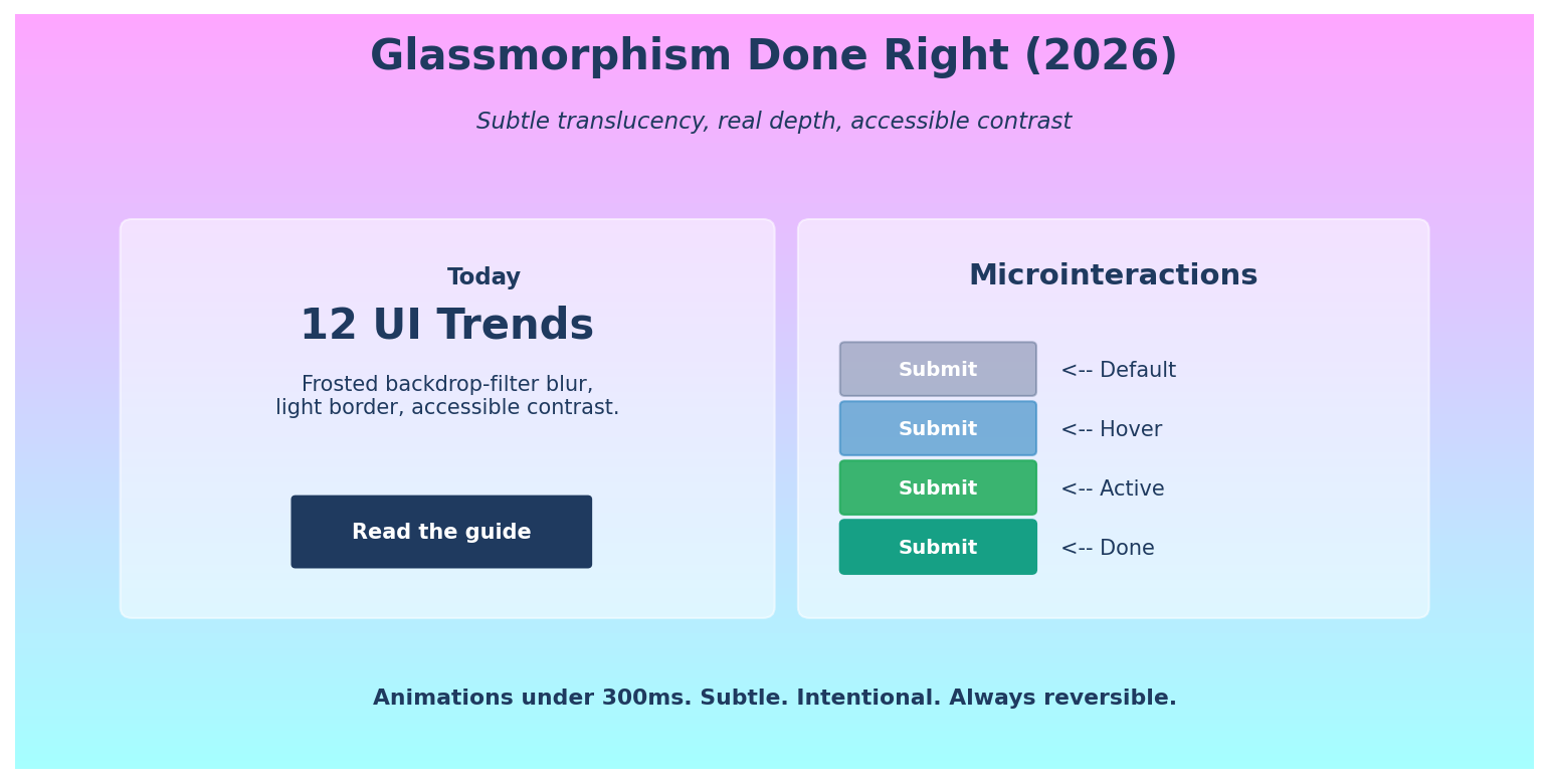
4.3 Responsible Glassmorphism
Glassmorphism has matured. The 2020 craze of heavy frosted blur on every panel is gone, replaced by restrained translucency on overlays, modals, and sticky navigation. Modern GPUs make backdrop-filter cheap on mid-range mobiles, so the bottleneck is no longer performance but accessibility.
How to apply: limit glass surfaces to overlays, modals, side panels, and floating navigation; always pair translucency with a subtle border (1px white at 20 to 40% opacity); test text contrast against the underlying scroll content, not just the static background; pre-render a fallback solid colour for older devices and Safari rendering quirks.
Watch-out: contrast fails fast when content scrolls behind a glass panel. Use WCAG-compliant solid colours inside the glass element to keep text legible.
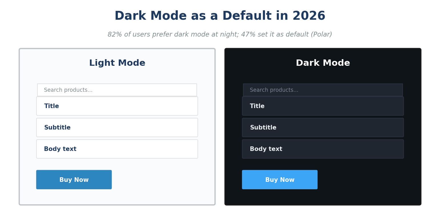
4.4 Dark Mode as a Default Pair
Dark mode is now expected, not optional. Industry surveys put preference at 82% for night usage and 47% as the always-on default. In 2026, the right approach is to design dark and light tokens together from the start, with semantic colour names (surface-1, surface-2, accent-strong, accent-muted) instead of literal hex values.
How to apply: define a token system (Figma Variables, Tailwind theme, CSS variables); pair every text colour with a passing AAA contrast ratio in both modes; soften pure black backgrounds (#000) to a near-black (#0F1419 to #121212) to reduce halation; reduce saturation of brand accents in dark mode by 10 to 15% to prevent eye strain.
4.5 Microinteractions and Intentional Motion
Microinteractions, the tiny animations that confirm a button press, validate a form field, or signal a success state, drive ~20% engagement lift (Index.dev). In 2026, motion is purposeful: subtle, fast (under 300ms), and always reversible. Animations that exist purely to impress users are out.
How to apply: every interactive element gets four states (default, hover, active, success or error); use cubic-bezier easing rather than linear; respect prefers-reduced-motion; keep durations between 150 and 300ms for UI feedback and 400 to 600ms for layout transitions; never animate just for animation.
4.6 3D and Spatial Design
WebGL, Three.js, and Spline have made interactive 3D shockingly affordable. Page time can rise 6x when 3D is used purposefully (typically a hero, a product viewer, or an explainer). Apple Vision Pro and Meta Quest also nudged spatial thinking into mainstream design.
How to apply: prioritise lightweight 3D (under 2 MB total assets, with progressive loading); use 3D where it adds product understanding (rotatable hardware, kinetic typography, data visualisation); always provide a static fallback for slow networks and reduced-motion users; never lock critical content behind 3D.
4.7 AI-Driven Personalisation
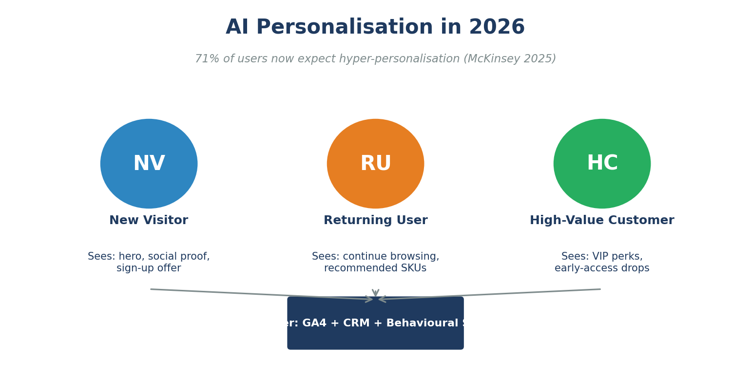
McKinsey reports 71% of consumers now expect personalised experiences, and 76% feel frustrated when they do not get them. In 2026, the leading approach is context-aware adaptation rather than invasive tracking: serve different content to new vs returning visitors, free vs paid users, mobile vs desktop, weekday vs weekend, and trending category vs evergreen browsers.
How to apply: define 3 to 5 user states; map each to a hero, secondary block, and CTA; route through edge functions (Vercel, Cloudflare, Netlify) for sub-50ms swaps; never personalise critical labels (price, availability) without disclosure; always provide an “off” toggle for personalisation.
Pair with strong conversion rate optimisation to measure each variant against revenue, not just engagement.
4.8 Voice UI and Zero UI
Voice search, voice commerce, and ambient assistants are quietly shifting how Singapore consumers act. Zero UI (interfaces with minimal visible chrome, driven by voice or gesture) is the long-term direction. In 2026, expect voice-only commerce flows in F&B, transport, and home appliances.
How to apply: optimise for voice search (FAQ schema, conversational long-tail keywords, concise sub-50-word answers); add voice search to apps where typing is friction (driving, kitchen, accessibility); design fallback text confirmation for every voice command.
4.9 Bold and Fluid Typography
Type is back as the hero. Variable fonts (Inter, Geist, Manrope, GT Walsheim) let designers adjust weight, width, and optical size at runtime, replacing 8 static font files with one. Fluid typography using CSS clamp() scales smoothly from mobile to ultra-wide without breakpoints.
How to apply: use clamp(min, preferred, max) for headlines and body type; keep 2 typefaces maximum (display + text); use weights 400, 500, and 700 unless brand demands more; check line-height to 1.4 to 1.6 for body and 1.05 to 1.2 for display.
4.10 Accessibility-First Design
WCAG 2.2 became the legal benchmark in many markets in 2024. Singapore Public-Sector Disability Inclusion guidelines (Enabling Masterplan 2030) raise expectations for private sector sites too. One in five users experiences interfaces differently from the average user (Microsoft Inclusive Design Toolkit).
How to apply: meet WCAG 2.2 AA at minimum; ensure 4.5:1 contrast for text and 3:1 for UI; provide keyboard navigation for every interactive element; test with axe-core, Lighthouse, and at least one screen reader (NVDA on Windows, VoiceOver on macOS); add skip-to-content links and visible focus indicators.
4.11 Dopamine Colour and Y2K Revival
After a decade of muted, minimalist palettes, bright saturated colour is back. Y2K nostalgia, dopamine design, and Gen Z-led trends pushed neon gradients, candy palettes, and high-contrast pairings into mainstream marketing sites and consumer apps.
How to apply: anchor a bright palette to a neutral base (white, off-white, or near-black) for accessibility; reserve saturated hues for accent surfaces (CTAs, highlights, illustrations); pair with Inter / Manrope-style modern sans for balance; avoid gradient text below 18pt (contrast collapses).
4.12 Gesture-Based Mobile Navigation
Mobile-first design has shifted from “tap” to “gesture”. Swipe up to dismiss, edge-swipe back, drag-to-refresh, and bottom-sheet patterns now feel native because iOS and Android pushed them to the OS level. With 77.58% of Singapore e-commerce on mobile apps, ignoring gesture patterns leaves money on the table.
How to apply: place primary actions in the lower half (thumb zone); replace top-tab nav with bottom tabs; use swipe gestures on cards (archive, save, dismiss); document gestures with subtle on-load hints; never hide a primary action behind a hidden gesture.
5. Mobile-Specific UI Trends for Singapore Apps
|
Trend |
What Changes |
Who Adopts First |
|
Bottom navigation |
Tabs at the bottom, not the top. |
Banking, F&B, retail apps. |
|
Adaptive haptics |
Subtle vibrations confirm key actions. |
Wallets, ride-hailing, fitness. |
|
Edge-to-edge content |
Removes safe-area padding for hero media. |
Streaming, e-commerce. |
|
Live activities |
Persistent live status (delivery, ride). |
Foodpanda, Grab, GrabFood, Deliveroo. |
|
App Clip / Instant App |
Mini-flows with no install. |
Ticketing, parking, payments. |
|
Server-driven UI |
Layouts driven by the backend, not app build. |
High-velocity teams (Shopee, Lazada). |
6. Free UI Adoption Checklist (Download)
Use our UI Trends 2026 Adoption Checklist (Excel) to score your website or app against every trend in this guide. The template includes:
- All 12 trends with one-line “why it matters” and a 1 to 5 adoption score column.
- Priority and Effort columns to plan the next quarter.
- Owner column so every trend has a named DRI.
- Auto-calculated total score (48+ best in class, 36 to 47 solid, below 36 redesign sprint needed).
- Instructions sheet with full methodology and review cadence.
7. Frequently Asked Questions
What are the most important UI trends in 2026?
AI copilot interfaces, bento grid layouts, responsible glassmorphism, dark mode as default, microinteractions, 3D and spatial design, AI-driven personalisation, voice and zero UI, bold and fluid typography, accessibility-first design, dopamine colour, and gesture-based mobile navigation.
Is glassmorphism still in style in 2026?
Yes, but in a more restrained form. Heavy frosted blur on every panel is out. Subtle translucency on overlays, modals, and floating navigation, paired with strong contrast, is the 2026 standard.
Should I redesign my Singapore website to follow these trends?
Only the trends that solve a real user problem on your site. Adopt 3 to 5 that align with your audience and brand. Run the free checklist first to spot the highest-priority gaps.
How important is dark mode for Singapore apps?
Very important. Roughly 82% of users prefer dark mode at night and 47% set it as default. For mobile-first markets like Singapore, ship dark and light themes together from day one.
Will AI replace UI designers in 2026?
No. 93% of designers already use generative AI in their workflow but 73% see AI as a copilot, not a replacement. The role is shifting toward strategy, system design, accessibility, and prompt design.
How does AI personalisation differ from invasive tracking?
AI personalisation in 2026 is context-aware, not surveillance-based. It uses observable signals (returning visitor, device, time of day) and explicit user preferences, with a clear “off” toggle.
What about accessibility? Is it still a trend?
Accessibility is no longer a trend, it is a baseline. WCAG 2.2 AA is the legal floor in many markets and the strategic floor everywhere. One in five users experiences interfaces differently from the average user.
How long does a UI modernisation project take in Singapore?
90 days for a focused refresh (audit, tokenise, prototype, ship 3 to 5 priority trends). 6 to 9 months for a full redesign that includes design system, content migration, and developer handoff.
Do these trends apply to Shopify and WooCommerce stores?
Yes. Most trends apply across CMS. For implementation, see MediaPlus Shopify and WooCommerce builds.
What are the worst UI mistakes Singapore brands still make?
Auto-playing video with sound, carousels above the fold, mystery-meat icon navigation, ignoring dark mode, skipping WCAG contrast, and shipping desktop-first layouts that break on mobile.
Conclusion and Next Steps
UI trends in 2026 share a common thread: they exist to help users do something faster, more confidently, or more accessibly. Pick the patterns that match your brand and audience, codify them into a design system, and ship under a 90-day cadence. Skip the trends that are decorative without being useful. Above all, treat performance and accessibility as non-negotiable.
Need help redesigning with these trends? Talk to the MediaPlus web design and development team. We also build Shopify stores, WordPress sites, high-converting landing pages, mobile apps, and e-commerce websites. Browse more on the MediaPlus blog.
Ready to modernise your UI for 2026?
Get a free 30-minute UI audit. Visit mediaplus.com.sg/web-design-and-development or download the free UI Trends 2026 Adoption Checklist to score your product against every trend in this guide.