When you’re planning a new website, app, or customer dashboard, the hardest part is usually the beginning. You have the idea, the features, the goals — but not the structure. That’s where wireframes make all the difference.
A wireframe is the blueprint of your digital product. It’s a clean, low-detail layout that shows where content goes, how users move through each page, and how the experience should work before you commit to design or development. It’s the step that helps teams stay aligned, avoid guesswork, and build with confidence.
At MediaPlus Digital, we use wireframes to help businesses shape their ideas into clear, user-friendly experiences. Whether you’re planning a new landing page, a full website redesign, or a complex digital interface, wireframes make sure the foundation is strong before the heavy design and coding begin.
Key Takeaways:
- Wireframes focus on content hierarchy and user experience, setting the stage for effective web design.
- Low-fidelity and high-fidelity wireframes cater to different stages of the design process, enhancing collaboration and efficiency.
- Wireframes help identify potential design flaws early, saving time and resources during development.
What Is a Wireframe?
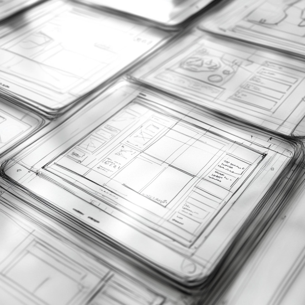
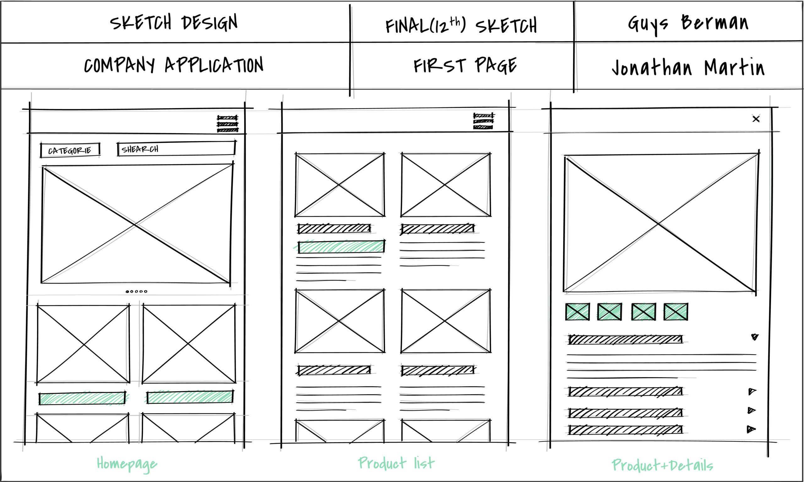
A wireframe is the blueprint of a digital product. It strips away colours, images, and styling so teams can focus purely on structure, layout, and user flow. Think of it as the skeleton of your website, app, or digital interface, showing how each screen fits together before any visual design begins.
A good wireframe lays out the essentials, such as:
-
Core screen layouts
-
Navigation menus and page hierarchy
-
Key UX and UI elements
-
Buttons, forms, and interactive components
In the early stages, wireframes are usually low-fidelity. They use simple boxes, basic shapes, and placeholder text instead of polished visuals. This keeps everyone aligned on functionality instead of getting distracted by colours, fonts, or branding too early.
Starting with wireframes also gives your UX/UI team more freedom to test ideas quickly. They can experiment with different layouts, validate user flows, and gather feedback before moving into high-fidelity design. By the time the visual design begins, the structure is already clear, the direction is agreed upon, and the user experience is grounded in real logic — not guesswork.
If you’re planning a new website or redesign, wireframing is one of the most important steps to getting it right from day one. MediaPlus Digital can help you turn your business goals into clear, user-first wireframes that set the foundation for a high-performing final design.
Why Wireframing is Critical for Web Design
In the competitive landscape of web design Singapore, wireframes play a pivotal role in ensuring project success. They provide a clear roadmap that helps teams align their vision, streamline collaboration, and enhance the overall design process.
Benefits of Wireframing:
- Improved Collaboration: Wireframes act as a visual communication tool that helps designers, developers, and clients stay on the same page. This reduces misunderstandings and ensures that everyone is aligned on the project’s goals.
- Faster Feedback: Since wireframes are simple and quick to create, they allow for rapid feedback and iteration. This means adjustments can be made early in the process, preventing costly changes later on.
- Error Detection: Wireframes help identify potential design and usability issues early, allowing teams to address them before moving into the more resource-intensive stages of design and development.
Case Study: Tech Dynamic
At MediaPlus Digital, we worked with Tech Dynamic, a client in the e-waste disposal industry, to create an intuitive and effective website. By developing detailed wireframes, we identified key areas for user interaction and conversion optimization. This meticulous planning resulted in a website that not only met but exceeded the client’s expectations, enhancing both user experience and business outcomes.

Wireframe Design Checklist
Wireframing gives your team a structured way to plan, build, and collaborate before any visual design or development begins. But how do you know when your wireframe is ready to move into mockups or high-fidelity prototypes? This checklist helps you confirm that your wireframe is complete enough to guide the next phase.
Before moving forward, revisit your initial scope of work. A solid wireframe often reveals gaps, opportunities, and requirements you couldn’t see earlier. Even if your wireframe is a simple grayscale sketch, it should clearly show:
- The essential screens required to meet user needs
- How users move through conversion paths or funnels
- Navigation structure and overall information organisation
- The main goal of each screen and how users achieve it
- Key UI elements and content placements
- How components come together to form reusable screen templates
A lot of beginners skip wireframing because they “just want to start designing.” Others copy existing layouts and hope they’ll fit. That almost always results in a layout that looks okay but fails to support the actual user experience.
Wireframes exist to prevent that. They shift the team’s focus away from colours and branding and back onto clarity, usability, and flow. As Tom says, “A wireframe gives people an early window into the project before you invest time polishing something. Aligning everyone early always saves time later.”
It’s also completely normal for the final design to look very different from the first wireframe. In fact, that’s a good sign. Wireframes give you space to test ideas, adjust flows, and try alternatives long before anything becomes expensive or time-consuming to change. With the structure sorted early, your final interface will feel more intentional and user-friendly.
Strong wireframes put usability first by focusing on:
- User flows and real use cases
- Ways to fix potential UX friction points
- Clear navigation and wayfinding
- A logical hierarchy of information
- Consistent page patterns
How to know when your wireframe works
There’s no perfect metric for a wireframe, but you can evaluate its effectiveness in a few practical ways:
- Run moderated user testing. If users can navigate the flows without being guided or confused, the structure is solid.
- Check stakeholder alignment. After presenting your wireframe, do people understand the concept? Can the project confidently move to the next step?
If feedback keeps drifting into colours, spacing, or “Can we make this look nicer,” it may be a sign the wireframe is too polished. Removing visual polish often shifts discussions back to user needs and functionality, which is exactly where early feedback should come from.
Why Choose MediaPlus Digital?
When it comes to web design in Singapore, choosing the right partner makes all the difference. At MediaPlus Digital, we don’t just build websites. We create high-performing digital experiences that help businesses grow with confidence.
- Proven Expertise: With more than a decade of hands-on experience, our team has designed, developed, and launched websites for companies across a wide range of industries. We bring a refined process, strong technical understanding, and a deep appreciation for UX best practices to every project.
- Certified, Award-Winning Team: Our work is backed by industry-recognised certifications and multiple awards. These aren’t just badges; they reflect our ongoing commitment to quality, innovation, and keeping our standards at the highest level.
- A Client-First Approach: No two businesses are the same, which is why we take time to understand your goals, audience, and brand positioning. Every website we deliver is tailored to drive real outcomes, whether that means more leads, smoother user journeys, stronger branding, or better conversion rates.
If you’re looking to elevate your online presence with a team that specialises in web design Singapore, we’re here to help.
Ready to take your website to the next level? Reach out for a personalised consultation and let’s map out the right strategy for your business.