The average landing page conversion rate across industries is just 2.35%. The top 25% of landing pages convert at 5.31% or higher. The difference between average and top-performing pages is not luck. It is systematic optimization.
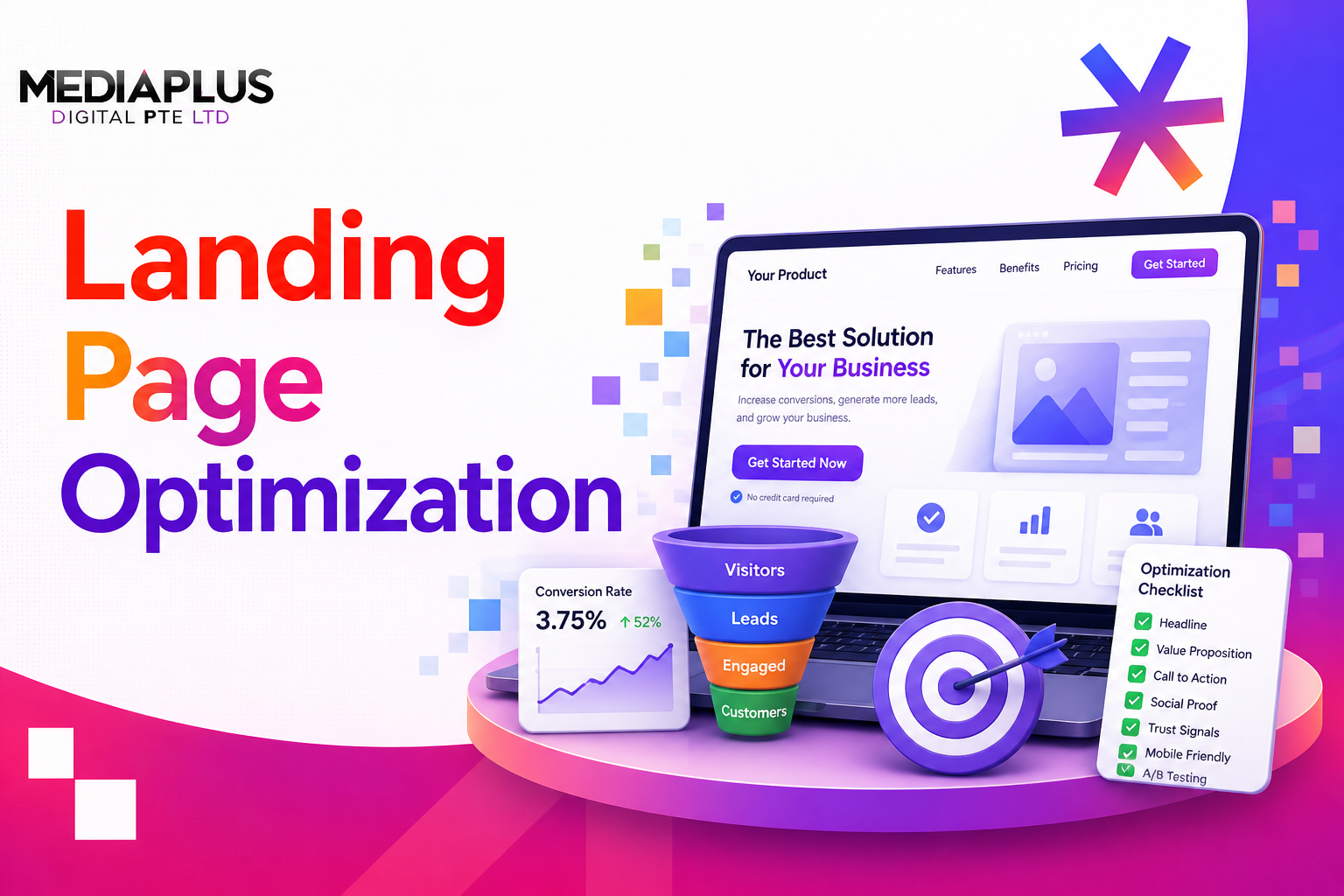
Landing page optimization (LPO) is the process of improving every element of your landing page to increase the percentage of visitors who take a desired action. In this guide, we walk through a proven framework covering everything from headline writing and CTA design to conversion psychology and A/B testing methodology.
What Is Landing Page Optimization?
Landing page optimization is the data-driven process of improving a landing page’s ability to convert visitors into leads or customers. Unlike general website optimization, LPO focuses specifically on pages designed for a single conversion goal, whether that is a sign-up, download, purchase, or enquiry.
LPO vs general CRO: Conversion rate optimization (CRO) applies across your entire website. LPO narrows that focus to individual landing pages, where small changes can produce outsized results because these pages carry the highest conversion intent.
Why Landing Pages Fail
- The headline does not match the ad or link that brought the visitor.
- Too many competing CTAs or distractions on the page.
- Slow load times, especially on mobile.
- No social proof or trust signals.
- Asking for too much information in forms.
- Poor visual hierarchy where nothing guides the eye.
The Landing Page Optimization Framework
Rather than a random list of tips, we recommend a structured approach:
Step 1: Audit Your Current Performance
Before optimizing, establish baselines. Track these essential metrics:
|
Metric |
What It Tells You |
Benchmark |
|
Conversion rate |
% of visitors who complete the goal |
2-5% average; 10%+ for top performers |
|
Bounce rate |
% who leave without interacting |
30-50% is acceptable for landing pages |
|
Time on page |
How long visitors engage |
30-60 seconds for short pages; 2-3 min for long-form |
|
Scroll depth |
How far down the page visitors go |
70%+ should reach the CTA |
|
Form abandonment rate |
% who start but do not finish forms |
Below 20% is good |
Use Google Analytics 4, Hotjar heatmaps, and Microsoft Clarity session recordings to gather this data.
Step 2: Understand Your Audience and Funnel Stage
Not all landing pages serve the same audience. The content, design, and CTA should differ based on where visitors are in the funnel:
- Top of Funnel (TOFU): Visitors are exploring a problem. Offer educational content, guides, or free tools. Keep forms short (name and email only). Use soft CTAs like “Download the Guide” or “Learn More”.
- Middle of Funnel (MOFU): Visitors are comparing solutions. Offer case studies, webinars, or product demos. Include more detailed forms. Use CTAs like “See How It Works” or “Book a Demo”.
- Bottom of Funnel (BOFU): Visitors are ready to act. Offer free trials, consultations, or pricing. Include strong trust signals and urgency. Use CTAs like “Get Started Free” or “Request Your Quote”.
Step 3: Optimize Core Page Elements
Headlines and Value Proposition
Your headline is the first thing visitors read and the biggest factor in whether they stay or leave.
- State the primary benefit clearly in under 10 words.
- Match the headline to the ad, email, or link that brought the visitor (message matching).
- Use a supporting subheadline to add specificity or address a pain point.
- Test question-based headlines against statement-based headlines.
Above-the-Fold Content
Everything visible before scrolling must communicate: what this is, who it is for, and what to do next.
- Include your headline, a brief description, and the primary CTA above the fold.
- Use a hero image or video that reinforces the message (not generic stock photos).
- Remove navigation menus. Landing pages should have one goal and one exit: the CTA.
Call-to-Action Design and Placement
- Use a high-contrast button colour that stands out from the rest of the page.
- Write action-oriented CTA text: “Get My Free Quote” is stronger than “Submit”.
- Place the primary CTA above the fold AND repeat it after key content sections.
- Surround the CTA with white space to draw the eye.
- Use a visual hierarchy: primary CTA (filled, bold), secondary (outlined or text link).
For more on designing CTAs that convert, read our guide on what makes an effective call to action.
Form Optimization
- Reduce form fields to the absolute minimum. Every additional field reduces conversions by approximately 7%.
- Use progressive profiling: collect basic information first, then ask for more in follow-up interactions.
- Show inline validation so users know immediately if an input is correct or incorrect.
- Add a privacy assurance near the form (“We will never share your data”).
Social Proof and Trust Signals
- Display client logos, especially recognisable brands.
- Include testimonials with real names, photos, and specific results (“Increased conversions by 47%”).
- Show review scores from Google Reviews, Trustpilot, or Clutch.
- Add security badges near payment or form areas.
- Include case study snippets with measurable outcomes.
Visual Hierarchy and Layout
Guide the visitor’s eye from headline to supporting content to CTA in a natural flow.
- Use the Z-pattern for simple landing pages (headline top-left, image top-right, benefits centre, CTA bottom-right).
- Use the F-pattern for longer, text-heavy landing pages.
- Group related information using proximity and consistent spacing.
- Use directional cues (arrows, eye gaze in photos) to point toward the CTA.
Our guide on web design principles covers visual hierarchy in depth.
Step 4: Apply Conversion Psychology
Scarcity and urgency: “Only 5 spots remaining” or “Offer ends Friday” creates a reason to act now rather than later. Use real deadlines, not fake ones.
Loss aversion: People are more motivated by what they might lose than what they might gain. Frame benefits in terms of what the visitor will miss without your product.
Anchoring: Show the original price before the discounted price. Display the most expensive plan first so the recommended plan feels like a deal.
Social proof: Humans follow the crowd. “Trusted by 10,000+ businesses” or “4.9/5 on Google Reviews” provides reassurance.
Message matching: The visitor’s expectation (set by your ad or link) must match exactly what they find on the landing page. Mismatched messages cause immediate bounces.
Step 5: Technical Optimization
Page Speed
Every second of load time reduces conversions. Target:
- LCP (Largest Contentful Paint) under 2.5 seconds.
- INP (Interaction to Next Paint) under 200ms.
- CLS (Cumulative Layout Shift) under 0.1.
- Compress images to WebP, minify CSS/JS, and use a CDN with Singapore points of presence.
Mobile-First Design
Over 60% of landing page traffic comes from mobile. Design for mobile first:
- Touch targets at least 44x44px.
- Single-column layout with thumb-friendly CTA placement.
- Simplified forms with auto-fill and mobile-appropriate input types.
- Test on real devices, not just browser emulators.
Read our guide on responsive web design best practices for more detail.
Accessibility
- Ensure colour contrast meets WCAG 2.2 AA standards (4.5:1 minimum for text).
- All form fields must have visible labels and logical tab order.
- Use semantic HTML so screen readers can parse the page correctly.
- Provide alt text for all meaningful images.
Privacy Compliance (PDPA for Singapore)
If your landing page collects personal data (names, emails, phone numbers), you must comply with Singapore’s Personal Data Protection Act (PDPA). Fines for non-compliance can reach S$1 million.
- Display a clear privacy notice explaining how data will be used.
- Obtain explicit consent before collecting personal data.
- Link to your full privacy policy from the landing page.
Step 6: SEO and AI Search Optimization
- Include your primary keyword in the page title, H1, meta description, and URL slug.
- Write a compelling meta description that matches search intent and encourages clicks.
- Use structured data (FAQ schema, HowTo schema) to enhance SERP appearance.
- Optimise for AI Overviews and LLM search: use clear, well-structured content that directly answers user questions. AI tools like Google’s AI Overviews and Perplexity pull from pages with clear, structured answers.
Our guide on SEO-friendly web design explains how to combine design and SEO effectively.
Step 7: Test and Iterate
A/B Testing Methodology
A/B testing is the backbone of landing page optimization. Here is how to do it properly:
- Start with a hypothesis: “Changing the headline from feature-focused to benefit-focused will increase conversions by 10%.”
- Test one variable at a time for clear cause-and-effect insights.
- Run the test until you reach statistical significance (typically 95% confidence level).
- Calculate the required sample size before starting. Use a sample size calculator to avoid ending tests prematurely.
- Document results and build an institutional knowledge base of what works for your audience.
What to Test (In Priority Order)
|
Priority |
Element |
Why |
|
1 |
Headline |
Biggest impact on first impression and bounce rate |
|
2 |
CTA (text, colour, placement) |
Direct impact on conversion action |
|
3 |
Hero image or video |
Influences emotional response and engagement |
|
4 |
Form length and fields |
Directly affects form completion rate |
|
5 |
Social proof placement |
Builds trust at critical decision points |
|
6 |
Page layout and content order |
Affects how users consume information |
Testing results feed directly into your conversion rate optimisation strategy.
Landing Page Optimization by Industry
- SaaS / B2B: Focus on demo requests or free trials. Use product screenshots, feature comparisons, and testimonials from recognisable companies. Longer pages work well because buyers need more information before committing.
- E-commerce: Focus on urgency and scarcity. Use high-quality product images, reviews, and clear pricing. Keep pages short and direct. Ensure the “Add to Cart” button is impossible to miss.
- Local services (Singapore): Focus on trust and proximity. Include Google Maps integration, local phone numbers, client testimonials from Singapore businesses, and relevant certifications or accreditations.
- Lead generation: Focus on value exchange. Offer something genuinely useful (calculator, assessment, whitepaper) in exchange for contact details. Keep forms short and explain exactly what happens after submission.
Browse high-converting landing page examples for real-world inspiration across industries.
Best Landing Page Optimization Tools (2026)
|
Category |
Tool |
Best For |
|
Analytics |
Google Analytics 4 |
Traffic sources, conversion tracking, audience insights |
|
Heatmaps |
Hotjar / Microsoft Clarity |
Visualising where users click, scroll, and drop off |
|
A/B Testing |
VWO / Optimizely |
Running controlled experiments with statistical rigour |
|
Page Builders |
Unbounce / Leadpages |
Building and testing landing pages without developers |
|
Speed Testing |
PageSpeed Insights / GTmetrix |
Measuring and diagnosing performance issues |
|
Session Recording |
Microsoft Clarity / FullStory |
Watching real user sessions to identify friction |
Landing Page Optimization Checklist
Use this checklist to audit any landing page before launch:
- Headline clearly states the primary benefit and matches the traffic source.
- Single, clear CTA visible above the fold.
- CTA button uses high-contrast colour with action-oriented text.
- No navigation menu or competing links.
- Form asks only for essential information.
- Social proof (testimonials, logos, reviews) is prominently displayed.
- Page loads in under 2.5 seconds (LCP).
- Fully responsive on mobile with 44x44px touch targets.
- Colour contrast meets WCAG AA standards (4.5:1).
- Privacy notice and consent mechanism for data collection.
- All images have alt text and are compressed to WebP.
- A/B test plan documented with hypothesis and success metric.
Frequently Asked Questions
What is landing page optimization?
Landing page optimization is the process of improving elements on a landing page (headlines, CTAs, forms, images, layout) to increase the percentage of visitors who complete a desired action, such as signing up, downloading, or purchasing.
What is a good landing page conversion rate?
The average is 2.35% across industries. Top-performing pages convert at 5-10% or higher. The benchmark varies by industry: SaaS averages 3-5%, e-commerce 2-4%, and lead generation 5-15%.
How long should a landing page be?
It depends on the offer complexity. Simple offers (free download, newsletter signup) work well with short pages. Complex or expensive offers (software demos, consulting services) benefit from longer pages with more information and trust signals.
Should I remove navigation from my landing page?
Yes, in most cases. Removing navigation keeps visitors focused on the single conversion goal. Studies show that removing navigation can increase conversions by up to 100%.
How many CTAs should a landing page have?
One primary CTA, repeated 2-3 times down the page. Avoid competing CTAs that give visitors multiple choices. One goal, one action.
How does page speed affect landing page conversions?
Pages that load in 1 second convert 3x higher than pages loading in 5 seconds. Every additional second of load time can reduce conversions by up to 20%.
Key Takeaways
- Landing page optimization is a systematic, data-driven process, not guesswork.
- Match your landing page content and funnel stage to the visitor’s intent.
- Optimise core elements: headline, CTA, form, social proof, and visual hierarchy.
- Apply conversion psychology: scarcity, loss aversion, anchoring, and message matching.
- Ensure technical fundamentals: fast load times, mobile-first design, accessibility, and PDPA compliance.
- A/B test continuously with proper methodology and statistical significance.
- Measure everything and build an optimization loop that never stops.
Need Help Optimizing Your Landing Pages?
At MediaPlus Digital, we design and optimise landing pages that convert. Our team in Singapore combines conversion strategy, UX research, and data-driven testing to turn more visitors into customers.
Explore our landing page design services or see results in our website design case studies.