
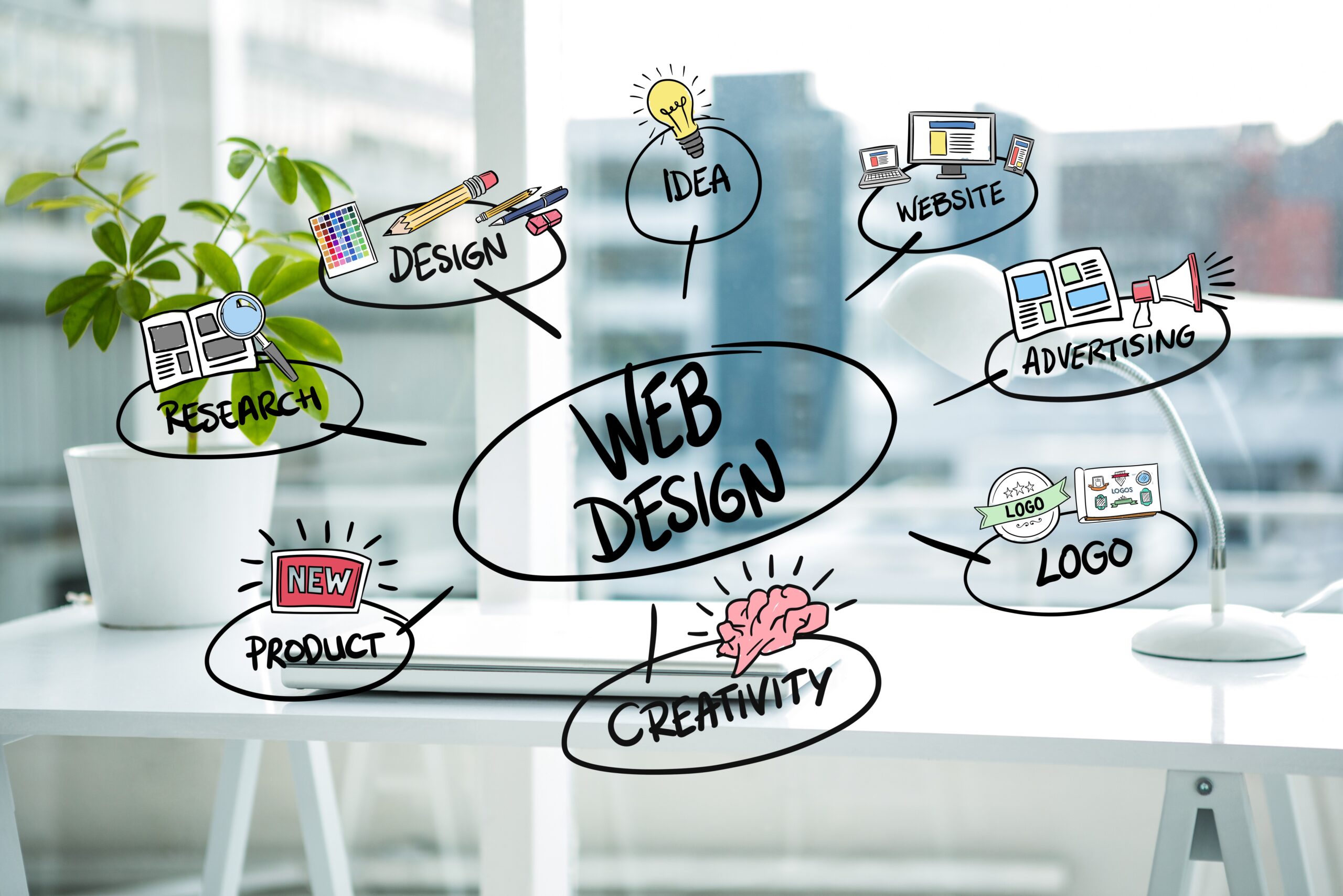
What Is Web Design?
Web design is all about creating the look, feel, and usability of a website or digital product. It’s how we ensure a site not only looks good but also functions smoothly for everyone. From colors and fonts to layouts and images, web designers bring these elements together to build an engaging, seamless user experience.
In simple terms, web design is the blend of art and functionality in a digital space. It’s not just about making websites visually appealing, it’s also about making them useful, intuitive, and enjoyable to navigate.

Web Design vs. Web Development
Although they’re often confused, web design and web development are two distinct disciplines that work together to create a functional and attractive website.
| Aspect | Web Design | Web Development |
|---|---|---|
| Focus | Aesthetics and user experience | Functionality and code |
| Responsibilities | Layout, colors, typography, images, interactive elements, UX/UI design | Writing code (HTML, CSS, JavaScript, back-end logic), database integration, site functionality |
| Tools | Figma, Adobe XD, Sketch, Canva | VS Code, Sublime Text, Git, Node.js, PHP, React |
| Goal | Make the website visually appealing, intuitive, and easy to navigate | Turn the design into a working website that functions correctly on all devices and browsers |
| Analogy | Architect who creates the blueprint | Builder who constructs the building |
| Skill Set | Creativity, visual design, UX/UI principles | Programming, problem-solving, debugging, technical knowledge |
Key Takeaway:
-
Web designers create the look and feel of the website, ensuring users have a smooth and engaging experience.
-
Web developers bring those designs to life through coding and technical implementation, making sure everything works seamlessly behind the scenes.
Understanding Users: The Heart of Good Design
Every successful website begins with a deep understanding of its users who they are, what they need, and what problems they’re trying to solve. Designing without this insight often leads to confusion, frustration, or low engagement. This is where information architecture and user-centered design (UCD) come into play.
User-Centered Design (UCD)
User-Centered Design is a philosophy that places the user at the center of every design decision.
-
Button placement: Position important buttons where users expect them, like a “Buy Now” button near product details.
-
Color choice: Select colors that not only match your brand but also make key elements stand out.
-
Layout: Organize content so users can find what they need quickly.
In short, UCD ensures your website is intuitive, enjoyable, and easy to use.
User Research and Personas
Before starting a design project, it’s essential to understand your audience:
-
Conduct user research: Surveys, interviews, or analytics can reveal what users want and where they struggle.
-
Create personas: These are fictional but data-driven profiles of typical users. They include demographics, goals, challenges, and behaviors.
Example: A persona for an e-commerce site might be “Sara, 28, a busy professional who wants fast, reliable online shopping with easy navigation and clear product details.” Designing with Sara in mind helps you make choices that improve her experience.
Key Web Design Principles Every Beginner Should Know
Great web design goes beyond aesthetics, it’s about structure, clarity, and overall experience. Here are ten foundational principles to guide beginners:
| Principle | What It Means | Example |
|---|---|---|
| Simplicity | Keep designs clean and focused | Minimalistic homepage with clear headings |
| Consistency | Uniform fonts, colors, and UI elements | Same button style across all pages |
| Visual Hierarchy | Highlight important content | Use larger fonts for headings, bold colors for CTAs |
| Mobile-Friendliness | Works beautifully on all devices | Responsive layout for smartphones and tablets |
| Easy Navigation | Clear menus and internal links | Sticky menu bar and breadcrumb links |
| Loading Speed | Fast load times for better UX | Compress images, minimize scripts |
| Accessibility | Design for everyone, including disabilities | Alt text for images, keyboard-friendly navigation |
| Feedback & Interaction | Interactive cues enhance usability | Hover effects on buttons, form submission confirmations |
| User-Centric Thinking | Always prioritize audience needs | Feature most popular products first for e-commerce |
| Testing & Iteration | Improve based on real feedback | A/B test button colors, collect analytics, and adjust |
By following these principles, beginners can create websites that are not just visually appealing, but also efficient, user-friendly, and aligned with user expectations.
Layouts in Web Design: Structuring Your Website Effectively
The layout is the foundation of any website, shaping how users perceive and interact with your content. A well-thought-out layout not only makes your site visually appealing but also ensures that visitors can navigate and find information effortlessly.
Using Grids for Balance and Organization
Grids are one of the most essential tools in web design, providing structure and balance to your pages. They help align text, images, and other elements consistently, making the site easier to read and navigate.
Grids are particularly useful for:
-
E-commerce sites: Display products in neat rows and columns, making shopping simpler for users.
-
Magazine or blog sites: Organize articles and images so content is visually digestible and attractive.
By using grids, you create a professional, organized look that guides users’ eyes naturally through the content.
Responsive vs. Adaptive Design: Meeting Users Where They Are
With the variety of devices accessing the web today, from smartphones to large desktop screens, it’s crucial to choose the right design approach:
-
Responsive Design: The layout automatically adjusts to fit any screen size, much like water filling a container. This approach is ideal for most modern websites due to its flexibility and SEO benefits.
-
Adaptive Design: Uses fixed layouts optimized for specific devices. While it offers precise control over design, it’s less flexible across multiple devices.
Tip: Prioritize responsive design to ensure accessibility, a smooth user experience, and future-proofing for new devices.
Mobile-First Design Best Practices
Designing with mobile screens in mind ensures your site works flawlessly on smaller devices before scaling up to larger screens. Focus on:
-
Prioritizing essential content: Highlight what users need most.
-
Touch-friendly buttons: Make clickable elements large enough to interact comfortably.
-
Optimizing images: Use smaller file sizes to reduce load times and enhance performance.
Starting mobile-first ensures your site is fast, functional, and user-friendly across all devices.
Whitespace and Visual Balance
Whitespace, also called negative space, is a powerful design tool. Contrary to popular belief, empty space is not wasted, it improves readability, emphasizes important content, and gives your website a clean, modern aesthetic.
-
Helps users focus on key elements without distraction.
-
Prevents clutter and cognitive overload.
-
Contributes to a polished, professional design that feels easy to navigate.
Visual Design: Making Your Website Come Alive
Visual design combines typography, color, images, and videos to create a cohesive, engaging experience for users.
Typography: Guiding Users Through Content
-
Select fonts that are readable and reflect your brand personality.
-
Establish a typographic hierarchy: large, bold fonts for headings, smaller, legible fonts for body text.
-
Use typography strategically to guide users’ attention naturally across your content.
Color Theory: Communicate Mood and Purpose
-
Stick to a consistent color palette that aligns with your brand.
-
Ensure sufficient contrast to enhance readability and accessibility.
-
Use color deliberately to highlight CTAs or critical sections.
Images & Videos: Enhance Engagement
-
High-quality visuals capture attention and increase user engagement.
-
Compress large files to maintain fast load times and smooth performance.
-
Sources: stock libraries like Unsplash or Pexels, or custom graphics for a unique, branded feel.
Tip: Visuals should complement your content, not overwhelm it.
User Experience (UX) in Web Design
Good UX ensures that your website is intuitive, enjoyable, and functional, helping users complete tasks efficiently while keeping them engaged.
Navigation: Your Website’s Roadmap
Effective navigation allows users to move seamlessly across your site. Best practices include:
-
Clear menus: Use concise labels like “Home,” “Services,” or “Contact.”
-
Consistent structure: Maintain uniform layouts across pages to build familiarity.
-
Accessibility-friendly: Include keyboard navigation and ARIA labels for screen readers.
-
Breadcrumbs: Show users their location within your site hierarchy for easy backtracking.
Example: On an e-commerce site, a visitor should navigate effortlessly from the homepage → category → product → checkout without confusion.
Interactive Elements: Engage Your Audience
Buttons, forms, and CTAs are the primary ways users interact with your site. To optimize them:
-
Make buttons and links visually distinct and clearly clickable.
-
Add hover effects or subtle animations to indicate interactivity.
-
Provide feedback: change button color, show a loading spinner, or confirm form submission.
-
Keep forms simple with clear labels and instructions, and only require essential information.
Example: A “Subscribe” button that changes color on hover and shows a confirmation message builds trust and ensures clarity.
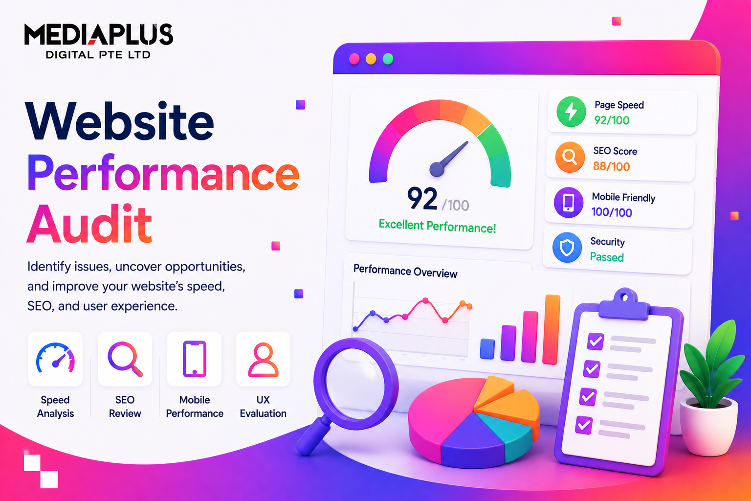
Loading Speed & Performance
Website speed affects both user satisfaction and search engine rankings. Optimize performance by:
-
Compressing images to reduce file sizes without losing quality.
-
Minimizing CSS and JavaScript by removing unused code.
-
Using a CDN to deliver content faster globally.
-
Enabling browser caching for repeat visitors.
A faster website improves engagement, reduces bounce rates, and enhances SEO performance.
Content Strategy: Words That Work With Design
Content is as important as design, it shapes user behavior, builds trust, and supports business goals. A strong strategy combines visuals with clear, engaging copy.
Writing for the Web
-
Use short paragraphs and bullet points for easy scanning.
-
Employ clear headings to guide readers through the page.
-
Use action-oriented language to encourage engagement, like “Download Now” or “Sign Up Today.”
Aligning Content with Goals
-
Conduct a content inventory to assess what you already have.
-
Build a sitemap to organize pages logically.
-
Ensure each page supports a specific user action or business goal.
Example: A web design agency page should address common user questions, highlight expertise, and include clear CTAs.
SEO and Keywords
-
Include relevant keywords naturally in headings, body text, and meta descriptions.
-
Prioritize clarity and context over keyword stuffing.
-
Optimize URLs and title tags for better search engine visibility.
Visual Storytelling
-
Infographics: Simplify complex concepts visually.
-
Icons and illustrations: Break up long text sections and guide users.
-
Videos: Demonstrate products, tutorials, or company stories dynamically.
Example: A tutorial page can combine images and short videos to help users follow steps more effectively.
Accessibility and Inclusive Design
A truly great website is one that everyone can use, regardless of their abilities, devices, or circumstances. Accessibility ensures that all users including those with visual, auditory, motor, or cognitive impairments can navigate and interact with your site comfortably. Inclusive design is not just a legal requirement in many cases; it also improves usability and user satisfaction for all visitors.
Follow WCAG Guidelines
The Web Content Accessibility Guidelines (WCAG) provide a roadmap for creating accessible websites. Key considerations include:
-
Sufficient color contrast: Text should stand out clearly from background colors to ensure readability for users with visual impairments. Tools like Contrast Checker can help.
-
Alt text for images: Provide descriptive alternative text for images so screen readers can convey information to visually impaired users.
-
Keyboard accessibility: Ensure users can navigate the entire site using only a keyboard. This includes menus, buttons, forms, and interactive elements.
-
Accessible forms: Label form fields clearly, provide error messages, and ensure that form interactions are intuitive.
Following WCAG helps make your website not only more inclusive but also more SEO-friendly, as search engines can better understand your content.
Test with Assistive Tools
Even after implementing accessibility best practices, it’s important to test your site with real assistive technologies:
-
Screen readers like NVDA, JAWS, or VoiceOver simulate how visually impaired users experience your site.
-
Keyboard-only navigation tests ensure all interactive elements are reachable without a mouse.
-
Accessibility checkers such as WAVE, axe, or Lighthouse highlight potential barriers and provide actionable suggestions.
Testing your site in multiple scenarios helps catch issues early and ensures a smooth experience for all users.
Testing Your Web Designs
Even the best designs need real-world testing to confirm that they work as intended. User testing and A/B testing are two critical methods for refining your site.
User Testing
User testing involves observing real users as they navigate your website. This helps you understand how they interact with your content, identify confusing elements, and spot usability problems.
-
Invite target users to explore your site and complete tasks.
-
Take notes on behavior and feedback to understand pain points.
-
Iterate based on observations to improve navigation, content clarity, and overall experience.
Regular user testing ensures your website aligns with your audience’s needs and expectations.
A/B Testing
A/B testing (or split testing) is a method of comparing two or more variations of a web page to see which performs better. It allows data-driven decisions for design, layout, and content.
-
Test variations: Change a button color, headline, image, or call-to-action (CTA) placement.
-
Measure results: Track metrics such as click-through rates, form submissions, or engagement.
-
Optimize continuously: Use tools like Google Optimize or Optimizely to implement winning versions and refine your site over time.
A/B testing helps ensure that even small design adjustments can have a big impact on user engagement and conversion rates.
Learning Web Design: Tutorials, Bootcamps, Online Courses, and Books
If you’re just starting out in web design, there’s no shortage of high-quality resources to guide you. From self-paced tutorials to immersive bootcamps, online courses, and books, there are options to suit every learning style and schedule. Here’s a detailed roadmap to help you get started:
Tutorials
Tutorials are a great way to dip your toes into web design at your own pace. Many are free, detailed, and beginner-friendly.
-
freeCodeCamp: One of the most popular free learning platforms, freeCodeCamp offers step-by-step lessons on HTML, CSS, JavaScript, and responsive web design. With interactive coding challenges and real projects, beginners can build practical skills while following a structured path. Their responsive web design certification is a must for anyone starting out.
-
Envato Tuts+: Tuts+ provides comprehensive video tutorials covering everything from the fundamentals of web design to responsive layouts and UX principles. Their courses often include downloadable resources, examples, and exercises to reinforce learning. A perfect option for visual learners who benefit from step-by-step demonstrations.
-
Flux Academy: Flux Academy offers a beginner-friendly 3-hour crash course that covers all the essentials of web design, including layout, typography, color theory, and visual hierarchy. The course is designed to give beginners a practical, hands-on introduction that can help kickstart a portfolio quickly.
-
MDN Web Docs (Mozilla Developer Network): MDN is an invaluable resource for beginners and advanced learners alike. It offers thorough documentation and guides on HTML, CSS, JavaScript, and modern web design best practices, with practical examples that can be applied immediately.
Bootcamps
For those who prefer intensive, immersive learning experiences, bootcamps offer a more structured and interactive approach. They often include live sessions, mentorship, and real projects.
-
Noble Desktop (USA): Noble Desktop provides comprehensive bootcamps covering design-to-code workflows. Students learn HTML, CSS, UX/UI design, responsive layouts, and prototyping, gaining practical experience to build a professional portfolio.
-
Skillcrush: Skillcrush offers a beginner-focused, free web design bootcamp that covers HTML, CSS, design principles, and basic UX concepts. It’s perfect for those who want a taste of web design without committing to a paid program.
-
BrainStation: BrainStation combines online and in-person learning with project-based courses. Students gain hands-on experience building real websites, mastering front-end design, responsive layouts, and user experience best practices.
-
Ironhack (Europe): Ironhack offers intensive web design and development bootcamps in cities like Berlin, Madrid, and Amsterdam. Their courses are practical and fast-paced, focusing on real-world applications and portfolio projects.
-
General Assembly (London, UK): General Assembly’s UX and web design bootcamps provide beginners with a strong foundation in HTML, CSS, and responsive design. The immersive format encourages collaboration and portfolio-building in a classroom environment.
Online Courses
If you prefer self-paced learning with flexibility, online courses offer structured lessons you can follow from anywhere:
-
Coursera (University of Michigan) – “Web Design for Everybody”: This beginner-friendly course covers web design from the ground up. Students learn HTML, CSS, responsive design, accessibility, and best practices for creating functional, visually appealing websites.
-
General Assembly (Online): GA’s online web design courses provide interactive, project-based lessons that guide beginners through creating real websites, covering fundamentals of user experience, design principles, and web development basics.
-
Ellak.gr: A simple and approachable online course, Ellak.gr introduces modern web design fundamentals, including responsive layouts, typography, color theory, and basic coding. Perfect for those who want a streamlined introduction without feeling overwhelmed.
Recommended Books
Books remain an invaluable resource for building foundational knowledge, exploring design theory, and understanding usability principles:
-
Don’t Make Me Think – Steve Krug: A classic on web usability, this book emphasizes intuitive design, user behavior, and the importance of simplicity in web design. Every beginner should read it.
-
Learning Web Design – Jennifer Niederst Robbins: Comprehensive and beginner-friendly, this book guides readers through HTML, CSS, JavaScript, and web graphics, gradually building practical skills from scratch.
-
The Principles of Beautiful Web Design – Jason Beaird: This book focuses on visual design essentials, including layout, color theory, typography, and imagery, providing a solid foundation for creating aesthetically pleasing websites.
-
Responsive Web Design with HTML5 and CSS – Ben Frain: Ideal for mastering modern responsive design techniques, this book teaches how to create flexible, adaptive websites that look great on any device.
-
Designing with the Mind in Mind – Jeff Johnson: This book dives into the psychology behind web design, helping beginners understand how users perceive and interact with websites. It’s perfect for learning why certain design choices work better than others.
Looking to Build or Redesign Your Website?
If you’re ready to bring your website to life, MediaPlus Digital is here to help.
We’re a Singapore-based web design agency specialising in custom, responsive, and SEO-optimised websites that help businesses grow online.
Whether you’re starting fresh or upgrading your existing site, our expert team can design and develop a website that reflects your brand, engages users, and drives results.
Explore our Web Design Services in Singapore or Contact MediaPlus Digital today for a free consultation.