A great website is not the one that looks the most expensive. It is the one that gets out of the user’s way. Good website principles sit underneath every page that loads fast, reads clearly, and quietly moves visitors toward an action. When those principles are missing, no amount of polish saves the design.
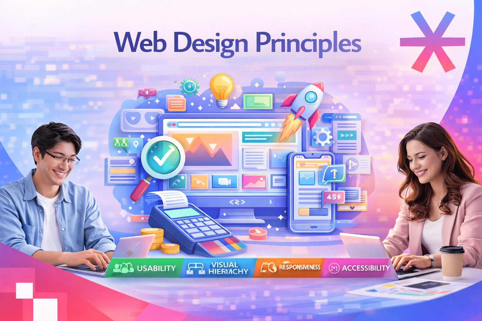
This guide collects the 15 website principles that matter most in 2026, organised across four pillars: usability, visual design, technical performance, and validation. Each principle includes a short rule, a practical explanation, and self-check questions you can run against any page on your site.
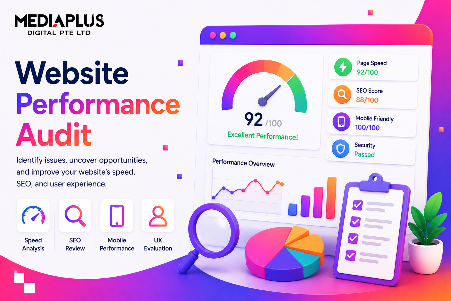
If you want a benchmark before reading further, browse the MediaPlus web design portfolio to see how these principles look in production.
What Website Principles Actually Mean
Website principles are the small set of rules that determine how a page is understood, used, and trusted. They sit above visual taste and below technical detail. They explain why two sites with similar code and similar designs perform very differently on bounce rate, time on page, and conversion.
These principles also overlap with UX design best practices and the foundations of SEO friendly web design. A site that ignores them can still rank, but it almost always under converts.
The 15 principles in this guide fall into four pillars:
|
Pillar |
Principles |
What it controls |
|
Usability |
1 to 6 |
How easy the site is to operate without thinking |
|
Content and visual design |
7 to 12 |
How information is read and understood |
|
Technical foundation |
13 to 14 |
Speed, mobile experience, and SEO surface |
|
Validation |
15 |
Whether your design choices survive contact with real users |
Pillar A. Usability Principles
1. Do Not Make Users Think
A great website feels obvious. When someone lands on a page, they should understand what they are looking at, where they can go next, and what actions they can take, without pausing to interpret labels or decode the layout. Every moment of hesitation is a small invitation to leave.
Online behaviour is simple. People follow clear paths, familiar patterns, and obvious cues. Clear navigation, intuitive hierarchy, readable labels, and recognisable design patterns reduce cognitive load and keep users moving toward their goal.
This is the same instinct behind good business websites. If something can be misunderstood on your page, eventually it will be. Remove the question marks before users have to ask.
2. Respect Users’ Patience
Visitors expect immediate payoff. Any barrier, even a small one, can trigger a drop off. A long form, a forced registration, or an unnecessary step before the value becomes visible will cost you a meaningful share of traffic.
Let visitors explore, test, and interact before asking for commitments. Once they feel the value, they are far more willing to share information. The less you ask for upfront, the more engagement you keep.
This principle is also why landing page optimization focuses on collapsing steps between arrival and conversion.
3. Focus User Attention
Some elements naturally attract the eye more than others. Images, bold typography, strong contrast, size differences, and subtle motion are tools for steering attention. Use them deliberately.
Highlight the action you want users to take, surface the information that matters, and create a visual path through the page. When you decide what deserves attention, users do not have to.
For a deeper look at how attention is directed on screen, read our guide on visual hierarchy principles for better web design.
4. Make Features Easy to Find
No one wants to hunt for basic actions. If a visitor has to click through several pages to find pricing, contact details, or the Add to Cart button, frustration compounds and most will leave.
Place important features where users expect them. Keep navigation visible and predictable. Maintain consistent layouts across the site so visitors do not have to relearn how the page works each time they move between sections. Visibility drives usability.
5. Stick to Web Conventions
Conventions exist because they work. After visiting hundreds of websites, users expect specific things to behave in specific ways.
A few that hold true in 2026:
- The logo links back to the homepage.
- Primary navigation sits at the top of the page.
- Shopping carts and account icons live in the top right.
- Underlined or coloured inline text means a link.
- Primary calls to action are bold buttons, not plain text.
Break these patterns and you create unnecessary friction. Be creative with branding, tone, and visuals, but be conservative with functional patterns.

6. Apply Fitts’s Law
The closer and larger the target, the easier it is to interact with. Fitts’s Law is simple to state and easy to underestimate. In a real interface, every interactive element is a target: buttons, links, icons, menu items, form fields.
A button that combines an icon and a clear label is usually easier to use than a small text link, because it offers a larger and more forgiving hit area. Critical actions deserve more space and better placement. Less important actions can afford to be smaller and quieter.
A classic application is the idea of an infinite click area. When an element is placed at the edge or corner of the screen, the boundary effectively becomes part of its clickable surface, so users can move toward it without aiming precisely. This is why operating systems anchor key menus to screen corners, and why thoughtful websites place primary actions where users can hit them without thinking, especially on mobile.
Pillar B. Content and Visual Design Principles
7. Write for Scanning, Not Reading
People do not read websites the way they read books. They scan. They look for keywords, headings, and visual cues that help them lock onto information quickly.
Effective web writing is:
- Short, with most sentences under 20 words.
- Direct, with the key point in the first line.
- Easy to skim, with descriptive subheadings and short paragraphs.
- Free of vague marketing language.
Good copy is a usability feature. For longer pieces, layer in the techniques covered in our call to action guide so each section ends with a clear next step.

8. Communicate Through Visual Language
Design is communication. Even without text, users read hierarchy, structure, and relationships through visual cues:
- Size and weight, which signal importance.
- Alignment and grouping, which signal relationships.
- Colour and contrast, which signal action and state.
- Typography and spacing, which signal tone and rhythm.
- Position on the page, which signals priority.
A well designed page explains itself. Users know what is important, what is connected, and where to click next without instructions.
9. Keep It Simple
Simplicity is one of the strongest predictors of a good user experience. Complexity does not impress users. It overwhelms them. The more cluttered the layout, the harder it becomes to find what matters.
Remove anything that does not support the primary goal of the page. Reduce visual noise. Give each element room to breathe. A simple interface is not plain. It is clear, confident, and comfortable to use.
10. Use White Space Wisely
White space, also called negative space, is not empty space. It is a design tool that shapes how content is read and understood. Used well, it:
- Breaks content into digestible chunks.
- Improves legibility and reading speed.
- Creates focus around important elements.
- Reduces cognitive load on every screen.
Generous spacing makes a layout feel modern, calm, and easy to explore. Cramped layouts feel cheap regardless of how good the underlying brand is.
11. Build a Coherent Colour Palette
Colour is the foundation of visual identity. It creates instant associations, sets the tone, and lets users recognise a brand without reading a single word. Strong brands are tied to specific colour combinations for a reason.
If you are starting from scratch, choose a small, coherent set of colours and use them consistently. One primary colour and one accent colour are usually enough. Supporting shades cover backgrounds, borders, and subtle emphasis.
Colour also drives hierarchy and attention. Accents should be reserved for important actions or highlights. When every element is colourful, nothing stands out. Used with restraint, colour instantly tells users what matters.
12. Master the Dot, Line, and Rectangle
Most layouts are built from three building blocks. Once you can see them, design stops feeling mysterious.
|
Element |
Role on the page |
Typical examples |
|
Dot |
Accent that attracts attention and signals importance |
Primary CTA button, badge, status indicator |
|
Line |
Guide that organises content and directs flow |
Navigation bar, dividers, progress indicators |
|
Rectangle |
Container that holds content |
Cards, hero sections, image blocks, text columns |
Problems usually appear when too many accents compete for attention or when containers are misaligned. Simplicity and restraint are the cure.
Pillar C. Technical Foundation Principles
13. Design Mobile First and Responsive
In Singapore, mobile traffic dominates almost every consumer category. A site that looks beautiful on a 27 inch monitor but cramps on a phone is functionally broken for the majority of its audience.
Mobile first design forces you to make the hard choices early. What is the single most important message on this page? What is the primary action? What can be hidden, moved, or removed? Once the smallest screen works, larger screens are easy.
For implementation patterns, see our notes on mobile first design and responsive web design best practices.
14. Optimise for Speed and Core Web Vitals
A slow site loses users before design has a chance to do its job. In 2026, Google still treats Core Web Vitals as a ranking signal, and users still leave when a page takes more than three seconds to become interactive.
The principles behind a fast site are blunt:
- Serve images in modern formats and at appropriate sizes.
- Keep critical CSS and JS small and load the rest later.
- Cache aggressively, both at the server and at the edge.
- Minimise third party scripts, especially in the head.
- Measure before and after each change.
Two longer reads on this: website speed optimisation and Core Web Vitals explained.
15. Design for Accessibility and Search Visibility
Accessibility and SEO sit on the same foundation: clear structure, semantic HTML, descriptive labels, and content that machines and screen readers can parse. A site that is friendly to assistive technology is almost always friendly to search engines.
Build in the basics from day one:
- One H1 per page, with a clear hierarchy below it.
- Descriptive alt text on every meaningful image.
- Sufficient colour contrast across text and interactive elements.
- Keyboard navigable forms and menus.
- Clean URLs, descriptive page titles, and structured data where it adds value.
For deeper guidance on each side, see the web accessibility guide and our notes on SEO friendly web design.
Pillar D. Validation Principle
Bonus. Test Early and Test Often
No designer, no matter how experienced, can predict every user behaviour. Usability testing is how you find the problems your team has stopped seeing.
Test early so you can fix issues before they multiply through the design system. Test often so you can catch problems that only appear once content is real and users are doing actual tasks. Even a handful of test sessions will surface the issues that hurt conversions the most.
Pair this with a structured improvement loop. Our notes on how to improve website user experience and conversion rate optimization walk through what to do with the findings.
Quick Self Check Across All 15 Principles
Run this checklist against any high traffic page on your site. Each unchecked row is a candidate for the next sprint.
|
Principle |
Self check question |
|
1. Do not make users think |
Can a first time visitor describe what this page is about within five seconds? |
|
2. Respect patience |
Is anything blocking value before the user is ready to commit? |
|
3. Focus attention |
Is it clear what the most important action on the page is? |
|
4. Easy to find |
Are key features where users expect them to be? |
|
5. Conventions |
Are any standard patterns broken without a strong reason? |
|
6. Fitts’s Law |
Are primary buttons large enough to tap on mobile? |
|
7. Scannable writing |
Can the page be understood by reading only headings and the first line of each section? |
|
8. Visual language |
Does the design explain itself without instructions? |
|
9. Keep it simple |
Is every element earning its place on the page? |
|
10. White space |
Do sections breathe, or does the page feel cramped? |
|
11. Colour palette |
Are accent colours reserved for the few things that matter? |
|
12. Dot, line, rectangle |
Is the layout structured or scattered? |
|
13. Mobile and responsive |
Does the page work as well on a small phone as on a laptop? |
|
14. Speed |
Does the page meet Core Web Vitals thresholds on a real mobile network? |
|
15. Accessibility and SEO |
Can a screen reader and a search crawler both read the structure clearly? |
Why These Website Principles Matter for Singapore Businesses
These principles are not theory. They control how visitors feel about your brand and how they behave on your site. Engagement, trust, conversions, and long term growth all come from a website that is easy to navigate and effortless to understand.
A stunning site that confuses visitors will never perform at its potential. A simple, intuitive, user centred site moves visitors smoothly from one action to the next, builds confidence, and turns casual traffic into returning customers. In a market where users have plenty of alternatives, this is the gap that decides who wins.
If you want a site built on these principles from day one, MediaPlus offers web design and development services in Singapore that focus on clarity, usability, and long term scalability. For sites that already exist but underperform, our website redesign service rebuilds them around the same principles without losing search traffic.
Pair the build with ongoing SEO in Singapore and structured conversion rate optimisation, and the compounding effect of these principles becomes clear within a few quarters.
Related Reads